2010-12-29

NBC Studio Tour @ 30 Rockefeller Plaza


Concept:  2 out of 5
Execution:  1 out of 5
Yeah, but:  Spotting NBC talent is rare, but not impossible!

The Long Version: When the ticket-taker said "wait there" and waved indistinctly down a hallway that curved out of sight, I should have realized that we were in trouble. True, disinterested and unhelpful people abound in New York in general, and its service/tourist industry in particular, but I shouldn't have been so jaded that I missed the warning signs. So perhaps in some way I'm responsible for what came later, but even while standing unattended behind a rope I still didn't see it coming. What happened next was the NBC Studio Tour, and yes, the fact that I can't link into its website in a way that avoids the animated intro should be yet another warning. But it's too late now, so let's proceed.

The NBC tour at 30 Rockefeller Plaza starts with the tour group shuffling into a small auditorium to watch a promotional video. While inside, we're told of the many upcoming delights of our visit - like no bathrooms, anywhere inside the NBC complex - and are sternly admonished to turn off our cell phones. "Not vibrate, not silent, not airplane mode: OFF." There's also Strictly No Photography, because everything we're about to see is "highly copyrighted". (That's the exact phrase that appears in their FAQ web page, which I can't link to.) I wasn't aware that copyright comes in different levels, but since NBC was recently fined millions of dollars for pirating someone else's intellectual property, maybe they know what they're talking about. Or perhaps, like some other image-based companies, they think that adding a superlative to the correct term will impress people.

With fifteen minutes of our hour-long tour now past, we were marshaled into a long queue for our security screening. Blogger Bob himself would be proud of its combination of intrusiveness and unpleasantness; if anything, the TSA screeners are more friendly and personable. The studio prohibits anything that the FAA won't allow on an aircraft, so forget about bringing that toner cartridge, but they also ban children under the age of six "for security reasons." I never realized that a preschooler could actually be used as a weapon, which must have some pretty serious ramifications for Disneyland.

Once cleared through security, the next challenge was the elevators. Our sizable group used two of them, which explained the two tour guides, and this was by far the most crowded I'd felt in the entire visit to New York. On the positive side, doing head counts and trying to squeeze everyone in provided the biggest spark of genuine enthusiasm that I saw from our guides throughout the tour. I don't know if this is because there's a betting pool going on in the staff room, or if there's a precedent of people sneaking off - I wasn't inclined to ask, and both options seem plausible.

The tour doesn't follow any established route, so it's impossible to say where it goes next. As the unlinkable FAQ points out, the building is "a very active working environment", so the tour is sent to whatever area has the least likelihood of having anything interesting happening. Not surprisingly, that turned out to be the stage for Saturday Night Live. More specifically, it turned out to be the glassed-in corridor above the bleachers for the live studio audience - but at least the hall was lined with photos, so there was a chance of seeing a publicity photo of someone famous as we hustled past. This explains why that wonderful FAQ page says that "spotting NBC talent is rare but not impossible" - although I doubt that they meant it as a double entendre.

Back through the elevators again and we're rewarded by being able to look through the glass of a dimmed control room, get shown an outdated video loop about makeup for SNL, and then the tour concludes with an audience-participation exercise involving a mock broadcast and some painful moments with a teleprompter and green-screen. There's also the mandatory souvenir prom-photo moment, with prints and DVDs available for purchase at the end of the tour.


We both felt a little stunned as we walked away from the NBC Studio Experience. I was certainly thinking it, but Penny was the first to say it out loud: "Thank Gosh for the New York Pass." That's the flat-rate tourist pass that we were using to see the city, and it meant that we hadn't actually handed over $20 - each - for the tour. I still think about all of the other things we could have done with the time, but at least that's all we were burned for.

But who knows? Maybe other people loved it; maybe it's the perfect moment for someone out there somewhere. Just because it wasn't right for me, and just because I can't conceive of who would really find this tour worth its time and expense doesn't mean that it couldn't happen. If this sounds like you, then please, please, please add a comment to say so. And never let it be said that I'm not an optimist.


last updated 29 dec 2010

2010-12-28

Radio City Music Hall Stage Door Tour


Concept:  2 out of 5
Execution:  4 out of 5
Yeah, but:  I may just be really lucky.

The Long Version: I'll admit that a tour of the Radio City Music Hall wasn't high on my list of things to do while on my honeymoon in New York City. I recognized the hall as a landmark when I walked by, and have some idea who the Rockettes are, but otherwise wouldn't have gone out of my way to see the interior. What a mistake that would have been - and her wanting to do the Stage Door tour is yet another example of how my wife is smarter than I am. I have no problem admitting that.


I know that I'm lucky, and in this case we were able to take the tour with a very small group. Our guide, Shannon, was exceptional: bright, interested, and involved in the life of the theatre. There was never that horrible reading-from-a-cue-card feeling, and she cheerfully answered any questions that our small-but-enthusiastic group had. I felt like I saw a lot of the building, and came away with an interest in its history that I never would have considered before. When Penny and I go back to New York, we'll probably make it just a little later in the year than our last trip just so that we can go back and see the Rockettes perform. After meeting one of the dancers in person, and getting a glimpse of their rehearsal, how could we not?


Photography is permitted through most of the tour, but I really don't have anything that captured the magnitude of some of the interior spaces. The tour itself lasted over an hour, but I can't say exactly how long because I was never inclined to look at my watch. Instead I just enjoyed myself and wandered along in amazement. After a crushingly bad experience elsewhere in the Rockefeller Center, the Radio City Stage Door tour restored much of my faith in the whole guided-tour tourist experience. Seeing a show at the Music Hall will be mandatory for the next time we're in New York, and we'll probably take the tour again as well.


last updated 28 dec 2010

2010-12-18

MoMA Ball Bearing Key Chain


Concept:  2 out of 5
Execution:  3 out of 5
Yeah, but:  If it hangs on a wall it’s a painting, and if you can walk around it it’s a sculpture.

The Long Version: Ball bearings are nifty things. The MoMA store - Museum of Modern Art, New York - is also nifty. Its website is where I first found the Mighty Wallet, of which I now own seven, and it also features the Ball Bearing Keychain. When I was in New York MoMA was one of my obligatory stops, but I hesitated before spending the not-insignificant cash to buy one of these iconic keychains. Eventually I rationalized it as a souvenir that I would use every day, but I have to be realistic: it's shiny, mechanical, and pointless. How could I resist?


The keychain itself is quite substantial, with a very heavy split ring to attach the keys to. One of my keys has a squared-off hole in the bow that binds on the ring, making the spare-no-expense build into a little too much of a good thing, but it hasn't been enough of a hassle to get me to change it. And while it may seem strange to say, this is a working ball bearing, so it's free to spin and move as it was intended to. It was a little stiff straight out of the box, but it loosened up after just a few days' use. The shaft diameter for the inner race is 15mm, making it just slightly smaller than a 4.25 ring size. Sticking a finger through it and twirling the keys around and around is surprisingly entertaining; I'll also toy with it and flip the inner race and cage around in those quiet moments when I'm idle but there's nothing interesting on my blackberry.


The polished stainless steel has been surprisingly difficult to scratch; while it does show a few marks, the keyfob in these photos has spent six weeks jostling around with lose change and other pocket items in addition to the keys that it carries. It's also quite heavy, which lets it bully its way to the bottom of a jacket pocket instead of getting tangled up in the gloves and toque that I invariably carry these days. That means that there's much less chance of launching my keys into a snowbank - a very good thing. With lighter summer clothes the weight might not be quite so welcome, so I predict that this keychain will need to be put aside when I'm not wearing a jacket.

The ball bearing keychain is an executive toy that's disguised as a tribute to an important machine with a fascinating design, but without the MoMA connection it would have been much harder to justify its cost. While I'm glad that I bought it after a happy afternoon in the galleries, I wouldn't buy another if something tragic happens to this one. But I'm not in any way dissatisfied: it's almost impossible for me to leave it alone when it's sitting on my desk, even when I have an important review to write. Never underestimate the entertainment value of things that are shiny, mechanical, and pointless.


last updated 18 dec 2010

2010-12-14

Berlebach Report 3032 Tripod


Concept: 3 out of 5
Execution: 1 out of 5
Yeah, but: Perhaps all tripods are vaguely annoying.

The Long Version:  It's hard to miss: Berlebach tripods are made out of wood. Well-seasoned ash hardwood, to be precise, stylishly accessorized with black hardware. They have a look to them that speaks of tradition and perhaps a little willful stubbornness. When I went shopping for a tripod to put under a monster medium-format film camera, it seemed like a good fit.

Choosing wood came easily. I swore I'd never buy another metal tripod after I used one in the winter, but the price of a carbon tripod that's sturdy enough for a ten-pound SLR - my beloved Fujifilm GX680III - would have me living in a tent. Wood is strong and resists vibrations very well, so after a lot of thought, the Berlebach Report 3032 came home with me from New York. And yes, I declared it, and it just happened that the customs agent was a photographer as well. Air travel really has made the world a smaller place.


Many Berlebach tripods have a built-in levelling ball with thirty degrees of travel; for a camera with a rotating back or a lens with a tripod collar, that's likely to be plenty of movement. The 3032 has a spring-loaded camera mounting screw instead of a centre column, and has only two leg sections, making it very long even when collapsed. I've given up a lot of convenience in exchange for strength by picking this particular model; there are other models that are less extreme and/or more practical. But where's the fun in that?

The 3032 is rated for twelve kilograms and weighs about seven pounds, which is almost twice the weight of the Gitzo carbon legs and ballhead that can handle the same load for four times the price. The aluminum Manfrotto 028 'triman' leg set, which is about the same bulk as the 3032 but with a geared centre column, weighs a kilo more and has the same carrying capacity. Every tripod offers its own set of compromises, making direct comparisons difficult, but as a material wood needs no excuses.


The levelling ball and easy-attach base were two of the features that most appealed to me about the 3032. But alas, not everything has worked out the way I hoped it would. While the levelling ball is strong and works very well, I have never particularly liked ball heads. I was hoping this one would win me over, but I constantly miss my Manfrotto 410 head with its ultra-fine gear-driven adjustments. Attaching the camera directly to the tripod without a quick release is very secure, and the spring-loaded tripod screw does make it very easy to attach a lightweight camera and lens - like a D700 and 105VR - but it just runs and hides when I try to finesse my ten-pound rollfilm SLR onto it. There are clearly some compromises in my future: either I'll need to relearn how I use a tripod or change how this tripod works. Most people, especially those without my love of complicated solutions to simple problems, will probably be quite happy with the tripod right out of the box.


My favourite tripod leg-lock design is Gitzo's excellent twist mechanism, which is fast and easy to secure. The best thing about them is that, unlike the cams of flip-locks, they're self-correcting: when they're tightened, they're tight. The screw-lock legs on the Berlebach are slower to use, but also give a positive lock and are perfectly suited to the material. If the wood expands or contracts, it just needs a few turns more or less to compensate. And the speed that I lose to the knobs is easily regained by having ruler-like indices on the legs to help set them all to the same length. I don't know why this isn't mandatory for all tripods.


The feet for the Berlebach are a hard plastic that screw down over spikes; the platforms on the metal end caps are to help drive the spikes into the ground. The hard plastic feet are excellent on concrete, but are too slippery to use on smooth surfaces. There's also no detent or locking screw that will hold the plastic feet down over the spikes, so hardwood flooring is a bad surface for a couple of good reasons. My little basalt Gitzo 1930 was clobbered by the Berlebach when I trialled them outdoors in strong winds, but the stability situation is reversed indoors in the classic camera-store press-and-wiggle test. Having to add industrial carpet to my studio isn't exactly what I had planned when I wanted to get the sturdiest tripod that not a lot of money could buy.


Another interesting quirk with my 3032 is that the leg pivots have very little friction. I usually carry my tripods by only one leg, but doing that with the Berlebach results in it unfolding itself. I've solved that problem by wrapping a strap around its ankles; it's a reflective one that I have for my bike, and is clearly visible in the lead photo. Ultimately it's not that big of a deal: it's just one more little thing to keep track of, which is part of the fun of photography. Because of the length, weight, and bulk of the wooden tripod, I'll use a tripod bag with handles and a shoulder strap when I need to transport the Berlebach any significant distance.


The leg locks on the Berlebach have three positions: roughly 20 degrees, 45 degrees, and 'off'. Theoretically the spikes or feet can be used to set the legs at any angle, but in practice I wouldn't want to put that much faith in them at anything lower than the (lockable) 45 degree setting. That gives the 3032 an effective minimum height of just over two feet, so there's no low-level benefit from not having a centre column. The tripod legs can also pivot beyond 90 degrees - except for the one that's blocked by the tension knob for the levelling ball - so the 3032 won't even provide a stable support when it's completely splayed out on the ground. Not that any of my tripods that lock at eighty degrees are worth anything in that position - there's far too much spring in the legs for that. But they don't claim that they have a minimum height of 3.5", which might be technically true for the 3032, but it certainly isn't useful.


There's a small subset of photographers who are genuinely "Tripod People", but I've never been one of them. I find them all - tripods - vaguely annoying and rarely worth their inherent inconvenience. By that standard the Berlebach compares quite favourably: somewhat annoying, physically and photographically inconvenient, but also tremendously strong, relatively inexpensive, and not metal. It does exactly what I bought it for, should last for decades, and has caused more conversations with complete strangers than any other tripod I own. Despite the way this review consists of little more than complaints strung together with stilted prose, I can recommend a Berlebach tripod to anyone who's looking for their combination of features and price. Just be aware that it behaves a little differently from the other tripods out there, and has its own learning curve. I can't say that I've become best friends with mine, but we're working it out.


updated two years and nine months later: One of the biggest nuisances about the 3032 is that its plastic feet are too slippery to grip properly on hardwood floors – they just skate along on any smooth surface. Today I fixed that with a $3 roll of hockey tape. Now the tripod is rock solid and is vastly more useful.

For non-Canadians: hockey tape is adhesive fabric tape that wraps around the blade of the hockey stick. It's designed to grab the puck, so its surface is both durable and grippy, and not at all bouncy the way shock-absorbing tape for a hand grip would be. I haven't yet seen how it will hold up on concrete, but ultimately it doesn't matter. A lifetime supply of tape costs about three bucks. They even make it in different colours.

For Canadians: hockey isn't our national sport. Get over it.


last updated 5 aug 2012

2010-12-05

Opinel #8 Knife


Concept: 3 out of 5
Execution: 4 out of 5
Yeah, but:  It has a certain maturity.

The Long Version:  It's hard to review a knife that predates the invention of the zipper. Its form is simultaneously refined and very basic, with a minimum of parts and an elegance that has endured for over a century. The Opinel knife is very simple, consisting of a blade and wooden handle joined with a pivot and locking collar. I bought the #8 size - 8.5cm blade, about 3.25" - to have something small and cheap enough that I can always have one in my bag for when I forget to bring a better one to work with me. I chose the carbon steel blade for better performance, but there's also a stainless version for lower maintenance.


While the knife wasn't razor-sharp right out of the package, especially toward the tip, it can easily take and hold a fine edge. But what makes the blade so useful is that it's very thin with a gentle convex grind. This isn't some über-strong knife that could split firewood, but instead its slender profile makes it perfect as a light utility knife. Picture a scalpel, x-acto, or box cutter: knives that really need to be sharp are thin. For slicing plastic and cardboard the reduced drag through the material makes for a much easier cut. I mostly use my working knives to split tape and break down cardboard boxes, and the Opinel easily slips in between the side flaps and box top, which a thick blade simply can't do.


Opinel's simple design has a rotating collar that can be used to lock the blade open, and in more recent knives, can also lock the blade closed. They can't be opened with one hand, don't have a pocket clip, and really aren't fancy in any way. They need a certain deliberation to use, and convey almost no "attitude", which can be far more useful than titanium liners and serrated blades. No, I wouldn't want to go into the woods for a week with just this knife to get me through, but for me carrying a different knife would be solving the wrong problem. There are bugs and stuff out in the wilderness - I'll stay in a motel instead.


When I bought the #8, I thought it would be the knife that gets tossed into my work bag and forgotten about, and I was only half-right. It weighs almost nothing and is cheap enough to be a spare, but it's also good enough that it's the one I reach for instead of my heavier knives. Not all the time, of course, and not for every task - but often enough that I'm planning on adding a couple of the smaller #6 size to my collection as well. There's a lot to be said for understated simplicity and the charm of an enduring design.


added: after writing this review, I've gone on to buy the #6 and #10 sizes as well. While I'm not sure that it makes sense to like something enough to want others that are similar but different, that's what happened here - and they're cheap enough that the set of three still cost less than what many 'basic' modern knives would run. Now that I've had a couple of months with them, I've written a new review that can be found by clicking here.


last updated 18 feb 2011

2010-12-04

Wendy's "Natural" Fries


Concept:  2 out of 5
Execution:  1 out of 5
Yeah, but:  Even I can't believe I'm reviewing a potato.


The Long Version: Fast-food burger restaurant Wendy's launched their New And Improved french fries almost a month ago in Canada. For those who aren't familiar with them, French Fries (aka "Freedom Fries" for my American readers) are narrow strips of a nutritionally deficient beige root vegetable that has been turned into candy by cooking it in one of the least healthy ways possible. So right off the bat, Wendy's efforts to attach connotations of wholesomeness by calling their new product "natural" is problematic at best.

So what's the difference between "natural" fries and the ones that they've served for the previous four decades? They're not peeled, and they use sea salt. Exciting times.

Wendy's previous favourite foodlike meal-filler were unremarkable but inoffensive; the new product has neither virtue. Thinner and stringy, they look like a 'grunge' version of the ones from McDonald's that go stone cold in the time it takes to eat a McNugget. The vaunted sea salt still has the same sandy table-salt texture, and there's far, far too much of it. A single 'medium' serving now contains one third of the RDA for sodium, up from a mere 23% for the old version.

From information gathered from their respective nutritional information web pages:

  • Mcdonald's fries per 100g - 319 calories, 15g fat, 239mg sodium.
  • Wendy's fries per 100g - 295 calories, 14g fat, 352mg sodium.

While french/freedom fries are never going to be healthy, Wendy's has moved in exactly the wrong direction on this. But even beyond the whole "real" and "natural" marketing spin, which is almost too absurd to be insulting, the results are bad. After three unsuccessful attempts to like them, I'm now actively avoiding Wendy's fries. Fortunately there are other foodlike fillers on their menu, but so far my solution has simply been to go elsewhere for lunch.

What can I say? For me, this is the straw that broke the Frosty's™ back.


last updated 6 dec 2010

2010-11-26

The North Face Base Camp Duffel bag


Concept: 2 out of 5
Execution: 4 out of 5
Yeah, but: Unless your name ends in “Sherpa” you don’t want to use it as a backpack.

Nearly all product descriptions and reviews of The North Face Base Camp duffel begin by trying to sell you on the bag’s ability to be strapped to a yak.

Admittedly, I’m lacking in the yak department, but I have found that the Base Camp Duffel is a good companion for my own beast of burden. For over 60,000km - from Newfoundland to Panama - the large, grey cargo carrier has been strapped to the back of a motorcycle, and it’s still going strong.


This review shows the medium sized bag, with a 70 litre capacity (4200 in3)

Large handles on either end offer a burly grab point for hefting it onto the bike, across rocks, or off of an airport baggage conveyor. There are also standard gym-bag duffel handles, though these seem useful only if you’re carrying a light load.

The removable “Alpine cut” backpack straps are lightly padded and have a comfortable curve. Being able to carry the duffel on my back allows me to keep both hands free for carrying the rest of my luggage and helmet. It's an appreciated feature on a bag this big. The backpack straps let me walk away from the motorcycle - everything in one load - to wherever I’m staying for the night. This can be a big deal in if you’re staying in a sketchy area.

That said, this is *not* intended to be a backpack - there is no hip belt or load bearing frame. With it’s barrel-like geometry and the amount of cargo a bag this size encourages you to carry, there is just too much weight on your shoulders to carry any long distance.

The big D-shaped lid opens like a trunk for easy access to your gear. The daisychains that run both lengths of the bag provide secure tie-downs that don’t interfere the opening of the lid. This makes for ideal motorcycle luggage.

*Note - The large white strip is reflective material I have added.

Other than the zippered pocket under the lid, there are no internal dividers. The "base camp" concept is that it’s a single piece of luggage used to carry other bags and gear to your destination.

I manage to carry: a tent and poles, sleeping bag, thermarest, motorcycle tools, tire irons, food, clothes/rain gear, tripod, netbook, AC adapters/chargers, first aid kit.

The length of the duffel fits the Manfrotto 190XB tripod, though I’ve found that the ball-head needs to be removed to get the legs in and out of the lid easily.

Four side compression straps help to tame less-than-full loads - the bag must be fairly full to maintain it’s shape and stay on the motorcycle securely. Of course, loose loads are no problem for carrying on buses, cars and airplanes. Or a yak.


The bag is made of a very thick laminate material, similar to the tarpaulin you’ll see on highway-going truck trailers. Solid stitching, bar-tacks and a hefty lockable zipper cause airport baggage handlers to gnash their teeth on sight of the burly bag.


Though the heavy material is obviously waterproof, the thousands of stitching holes will let water drip in over time. I'm talking heavy rain for several hours here, a quick downpour won't be a problem.

Water resistant, yes. Water proof, no.
In practice, this hasn’t been much of an issue. Anything that can’t be wet gets put in a drybag before it goes inside the duffel.

There are 100% waterproof duffel bags out there, but dry bags have few tie-down points. Getting to your gear means you have to unlash/re-lash the bag every time. That’s a big deal considering how often you need to get to your food, or warm clothing. The Base Camp duffel is just more “livable” for day to day use on a long trip.

Fumigation at the Belize/Guatemala border 

The Base Camp Duffel has been through torrential rain in Newfoundland, sandstorms in the Sonoran desert and muddy mountains in Guatemala. The worst I can report is two bar-tacks on the daisychain popping out after many months of strain on the road. I’ve been told by a North Face rep’ that I can send it in for free repair under warranty.
I’ll be using this bag for years to come, it just works.


I’ve given the Base Camp Duffle a 2 out of 5 for concept, it’s just a duffel bag after all. But it deserves a 4 out of 5 on execution for it's build quality and  for having just enough well thought out features to be useful. There’s no fluff on this duff'.

Anthony teaches  motorcycle travel photography at www.motojournalism.com

2010-11-21

Leatherman Serac S2 Flashlight


Concept: 2 out of 5
Execution: 2 out of 5
Yeah, but: It's nice and small, and that may be enough.

The Long Version: Leathermans achieved a rare accomplishment with the S2: they market both a flashlight and multitool under the same name. That's an own-goal that even the camera companies rarely accomplish – very impressive. This review is of the flashlight, which takes a single AAA battery with an aluminum case and two power settings.

I use this light as a little torch that I can carry everywhere in my Billingham Hadley camera bag; I need something dressy but small. It travels with me, lets me find my way in strange hotel rooms, and shows if I drop something in the footwell of a car, bus, or plane. Handy stuff, but this is a light utility light, not something I'd be using to explore a dark alleyway or abandoned building.


The S2 has two power settings, one of which is too dim to read by, and the other is too bright to use for very long. They're selected by lightly pressing the tailcap switch; each press toggles the mode, which means that it alternates between bright and dim each time the light is turned on. To hit this point again: whichever brightness setting was useful last time is not what it will turn on with the next time. Handy, no?

The redeeming feature of the S2 is that it has a built-in regulator. This means that the brightness remains constant for most of the battery's useful life, while other lights will peak early and then taper off. It's a nice feature, and suits a light with this sort of a price tag.

So the S2 is small with businesslike styling, has two brightness settings, and has a consistent output. It's a nice mix of features, and does what I want it to. It's just that the brightness toggle bugs me. It's not a critical flaw, but it is enough that I wouldn't rush out to buy another one if my current S2 flashlight were to get lost. It does the job, but it's not that hard a job to do.


last updated 21 nov 2010

2010-11-15

Kodak Portra 400


Concept: 3 out of 5
Execution: 3 out of 5
Yeah, but: Not the NC or the VC, just 400.

The Long Version: One of the more interesting souvenirs that I brought home from New York City was an exposed roll of the brand-new Portra 400 from Kodak. This film replaces the previous 400VC and 400NC formulations, and from the press release, it sounds like it's combined the best of both with no downsides. Sounds nifty, verging on too good to be true, but so far it looks like they really have pulled it off.


I have to concede that I'm not the best person to judge the new film, especially since the good people at Kodak only gave me one roll to try. Feel free to open these sample images (above and below) in a new window and replace the final "S" in the file name with "L" to see a larger image. On the other hand, what you'll be seeing is an electronically scanned version that's been reinterpreted by a different monitor in a limited colour space. I've made some effort to get the colours to look like the prints, but those are scanned second-generation copies as well. Unlike with transparencies, there's really no definitive colour reference.


For a subjective comparison, I've been showing the prints from my evaluation roll around, and have gotten positive reactions from friends, fellow photographers, and the photo lab. The colour is quite good - vibrant without being garish, and holds up quite well for portraits. Scanning it with my Nikon V driven by Vuescan is as easy as any colour film that I've tried, giving good to excellent results with very little effort. Grain is a non-issue, both because it's invisible in smaller prints, and because it's not a fault with film in the same way that noise is with digital capture.


While I don't anticipate Portra 400 replacing the quirky but powerful Ektar in my small-format cameras, I would choose it for any subject where the faster speed would be appropriate, or even for the times when I just want a no-fuss film for unpredictable conditions. I'll always have a couple of rolls on-hand as a solid second choice. Low-light photography will fall to Fuji's Press 1600, or perhaps I'll just bring my D700 out of its semi-retirement from time to time.


Updated 11 jan 2011: I've now had a chance to use the 120 film in my medium format camera, and it has become my standard colour film. Its results are as good as I hoped, with excellent tone and is very forgiving when confronted with over-exposure. I've put some large sample images and additional text over on my photo blog.

The new Portra 400 looks like Kodak really has improved on the previous Neutral Color and Vibrant Color formulations, and it's certainly better to see a new film than to simply discontinue an unpopular one. The quality that I've seen so far is very promising, and Kodak should be applauded for continuing their efforts to succeed in the marketplace.

2010-11-14

Porter Airlines, from Toronto Island Airport


Concept: 3 out of 5
Execution: 5 out of 5
Yeah, but: How often do you rave about an airport?

The Long Version: I don't mind flying, but I dislike airports, and Toronto's Pearson International deserves a special mention as an abysmal place to spend time. It's crowded, poorly run, and inconveniently located in Mississauga. It's so bad that it's even worse than other airports, and that's really saying something.

But it's a little-known fact that Toronto has an airport located right downtown - its existence has certainly come as a shock to all of the people who have bought condos on the waterfront. There's just one single airline operating from it right now, but when it came time to book a flight to New York City, flying Porter out of Toronto's Island Airport was a natural choice.


Porter is a small airline that mostly targets short-hop business travel, flying 70-seat Bombardier Dash 8 turboprops. This is a different experience from a big jet, and it all comes down to working on a smaller scale. These little planes make money even when they're half empty, so instead of crushing through security and customs with hundreds of vacationers, imagine travelling with a small group of business-people that could easily fit in a nice motorcoach. The only downside that I found was that the ride was a little bumpier than on a jumbo-jet flying ten thousand feet higher; the cabin noise was a higher pitch, but not as loud as the normal jet roar. The flight from Toronto to New York is long enough to take off, eat the world's smallest box lunch, and land. Even if that was the entire experience, there's no question I'd be flying with them again. But it gets even better than that.


Because of political opposition to the long-running existence of the island airport, the experience starts with a 400-foot ferry ride across the Western Gap. The single ferryboat runs every fifteen minutes, and Porter has a check-in counter in the mainland terminal that can occupy some of the waiting time. Once on the island, there's an enclosed walkway to the main terminal building, and getting to the gates involves the minimum amount of hassle that's allowed by law. Instead of arriving three hours early for US-bound flights leaving from Pearson Airport, Porter recommends reaching them just one hour before the flight takes off. Travellers clear US Customs and Immigration once they arrive, but the time I saved by not having to drag out to the suburbs and then stand in line until it's my turn to be rushed to the front of the queue so that I can just barely catch my flight is immense. Even if that was the only benefit of going through the island airport, I'd do everything I can to never see the inside of Pearson International again. But it gets even better than that.


Just past the final escalator into the waiting area there's a decent-sized kitchen area with a drink fridge, snacks, and stations for making coffee or tea. I looked around for someone to pay, expecting a trap, but it's all complimentary. I can't think of the last time I was surprised by not having to pay for something relating to air travel. I may still have a packet of almonds to show for it, as well.


Off to one side of the terminal's lounge is a business centre with better than a dozen iMac computers. A waiting area that looks like the lobby of a nice hotel, free computer time, free internet access, free cans of coke - in an airport terminal.

Commercial air travel is one of those things that as been getting worse every year, and that's been the case for a very long time. It's nice to have an airline that has reset the clock and brought in a high-end service that doesn't cost any more than a comparable flight from one of the lousy airlines flying from an expensive and nasty terminal. From now on, if I have a choice, I'll be taking Porter from the Toronto Island Airport, even if I have to change my itinerary to do it. There's simply no comparison.

If there's one thing Porter loves, it's emailed discount codes. Unless otherwise noted, each code is for 30% off:

ART30 – book by 6 apr 2011, travel apr 15 - sept 6 2011
SWEET30 – book by 20 apr 2011, travel may 1 - sept 6 2011
DRUM – book by 4 may 2011, travel may 12 - sept 6 2011
SIZZLE – book by 18 may, travel may 27 - dec 15 2011
CIRCUS – book by june 1, travel june 9 - dec 15


last updated 28 apr 2011

2010-10-24

Leif Benner, Goldsmith


Concept: 4 out of 5
Execution: 4 out of 5
Yeah, but: I even like his watch.


The Long Version: When I write a review, I try to combine an expansive breadth of knowledge with incisive specificity. This time I can't do that – while I do know a bit about jewellery and jewellery stores, I don't spend any time researching and shopping around. Whenever I need something nice in gold, I just head down to see Leif Benner. He's a goldsmith and designer located in Toronto's Distillery district, an arts incubator that's something of a tourist attraction in its own right.


As often happens, I needed to see a jewellery designer because I wanted to get married, and found the perfect ring as soon as I walked into Leif's studio. Planning a wedding is a lot of hard work – I should know, I've watched someone do it – but working with Leif has always been easy. When Penny and I were looking for wedding bands, he deftly talked us away from a significantly more expensive design by showing us how it wouldn't be a good compliment to Penny's engagement ring. For my band, he took the time to go through a number of different options that I never expected to have, and I've come away with a ring that's exactly right for me - it's square. What more can I say?


Leif's clearly enthusiastic about his art, and I never hesitate to recommend him to anyone who's looking for something special in gold or precious stones. He's both a talented designer and a pleasure to work with. Either trait is hard to find, but getting them both together is remarkable and worth supporting. After getting an engagement ring and a wedding band set from Leif, I can't see ever going anywhere else.


2010-10-13

Red - The Movie


Concept: 3 out of 5
Execution: 4 out of 5
Yeah, but: Toronto-spotting is a hobby of mine.


The Long Version: I'm not someone who goes to the movies very often, but when Penny tells me that she's scored a pair of comp passes to an advance screening, I'm not about to stay home. So tonight I found myself sitting in a packed theatre waiting for the start of a movie I'd never heard of, featuring a whole cast of stars that I had only intermittent knowledge of, without any real expectations.


Red - the movie - turned out to be a huge success. It's fairly smart, well put together, and entertaining. In its structure and style, it's almost more of a 'caper' movie than an action/adventure thriller. Being based on graphic novels gives it a certain super-hero aspect to some of the characters, but it's more of a postmodern too-cool Tarantino style than Superman, if you know what I mean. Some of the camerawork and choreography brought gasps from the audience; the price of admission is worth it just to see the most awesome exit from a police car ever conceived.


While this is an exceedingly violent movie, it's not heavy on the gore. People tend to disappear in bloodless explosions or get nocked down - there's no sense that we're in the middle of a first-person shooter video game or a slasher movie. And even places where it does get quite graphic, such as a direct grenade hit in the container yard, it tends to be as much of a visual shock as a horror show. Red doesn't seem to revel in human suffering as much as The Expendables did. In fact, I generally found that particular Badass Grandpa movie much less satisfying than this one, and Red never felt like a vanity project. If you're tying to decide between the two, unless you're a huge Stallone fan, pick Red instead.


I think this is the first time I've gone to an action movie and come away thoroughly impressed with the acting. Sure, Morgan Freeman's a given, but John Malkovich stole every scene he was in. And then there was Bruce Willis - who knew?


Even while I was watching the movie I was making plans to buy the DVD. Red will be great on a decent TV with a good sound system, but it really is worth seeing with an audience. This could become the first movie I'll watch in the theatres more than once since - I'm embarrassed to say this - Pump Up The Volume. For those who can't think back to 1990, that's the movie where Christian Slater plays a disaffected and maladjusted youth. In my defence, it had some redeeming moments (nsfw), and I was sixteen years old. But I digress – Red is one of the best movies I've seen in a very long time, and not to be missed if this genre is something you think you'd like.


2010-10-02

The Visual Story, 2nd Edition, by Bruce Block


Concept: 4 out of 5
Execution: 4 out of 5
Yeah, but: It's an advanced introduction of the basics.


The Long Version: It's important for photographers to be interested in something other than photography. No matter what the subject is, photos are more likely to be successful when there's an outside interest to drive them. Similarly, it's important that photographers get away from other photographers, especially the herd-mind of forums, flickr, and photo-bloggers. But that's not exactly original advice: novice photographers are often told, with sage wisdom, to study the works of master painters. Where the advice falls short is the impression that learning from other media is just for beginners, and in its very narrow view of what constitutes acceptable artistic ideas.


What Bruce Block's book "The Visual Story" brings to the conversation is a master's experience in motion pictures. Since the fundamentals of space, perspective, and composition are the same for single photos and for footage, it's easy to directly apply most of the material in The Visual Story directly to still photography. The books' content that deals with time - movement, repetition, pacing, themes - is also useful for photographers whose ambitions include cohesive portfolios and projects. There's very little that doesn't apply to stills at all, as the book is designed to provide an education, not replace a technical manual.


I was sold on The Visual Story as soon as I found it in the local MegaBooks store. Flipping through it - and the store's photography section in general - to pass some time, I hit on Part B of the Appendix: "Lenses' Effects on Space". In three pages, with six illustrations, Bruce Block not only explained depth of field in a way that I finally understood, but threw in an explanation of 'telephoto compression' as well. I walked away stunned, and promptly ordered the book from the same store's website for considerably less money, with free shipping. Gotta love the internet, with apologies to my fellow under-appreciated retail workers.


I've read Block's book a couple of times now, and I'm going through it once again as I write this review. I'm constantly being reminded of how much I get out of this book. The section on camera movements, specifically how the dolly, crane, and track differ from zoom, tilt, and pan in their depiction of space, blows away thousands of internet posts about "zoom with your feet". It's no coincidence that prime lenses now make up 75% of my collection, and that's just from getting to Page 30 in The Visual Story. Having a subtly different perspective from still photography, and having a different set of problems to solve, brings a depth and detail to discussions that generic photo-instruction books never even get into.


The essence of The Visual Story is that Bruce Block identifies six basic visual components, and discusses how they're applied in creating imagery. Essential to the discussion is the role of contrast and affinity - difference and similarity - in controlling visual intensity. In the sample above, on the right-hand page, are examples of affinity (top) and contrast (bottom) in brightness range; the left-hand page shows contrast and affinity in saturation. After all, this book isn't about taking pictures, or even making movies: it's about controlling the visual structure so that the images say what you want them to.


If I was to create an essential reading list for photographers, The Visual Story would come after "Understanding Exposure" but before "Light, Science, and Magic" and "Perception and Imaging" as the important books to read. Those four books - the last three, anyway - aren't particularly written for dummies, but they cover everything from a practical introduction through to some advanced and esoteric concepts. After that, the rest of the bookshelf is either entertainment or manuals - both of which can be useful, but none are enlightening. Sure, keep looking at paintings and photos, but also watch movies, study advertisements, and learn from graphic designers. And don't forget to be interested in something outside of photography.


2010-09-27

Chipotlé Mexican Grill

Aztec Chic (a.k.a. Chipotles)
Custom designed artwork by Mayatek, Inc, at a local Chipotlé
(South Kirkman and Metrowest Blvd location)

Concept: 3 out of 5
Execution: 3 out of 5
Yeah, but: Mine is better than yours.
The Long Version: There are times when a body just has to have a heaping helping of carbs, salt, protean, and fats, and they want it Now. And then there are times when you want all of that, but with a bit more class than the typical burger joint. If you're in that kind of mood, then there is no better place to sate that hunger than at a Chipotlé Mexican Grill.

Chipotlé Mexican Grills are all over Orlando (and in other civilized areas, including two locations in Toronto). They're quite distinctive with their brown or gray industrial metal signage and the distictive Chipotlé name prominently displayed.

Chipotlé Mexican Grill, University Blvd
Typical exterior, oxidized bare metal Industrial Mayan.
(University Blvd location)

Once inside, you're presented with what can be best described as Mayatek decorations; bare concrete floors, lots of bare corrugated metal on vertical surfaces, and shellacked laminated plywood over all the horizontal surfaces. It gives each store a distinctive ambiance for the masses, one that certainly sets it apart from the look-alike burger joints, especially the hideous McDonalds near major tourist attractions.

One unexpected consequence of going into these stores for me (and probably one of the odder reasons I'm attracted) is the extensive use of all that sanded and shellacked laminated plywood. That type of wood, for whatever reason, was a big do-it-yourself raw material in the1950s and early 1960s. I know this, because my dad used it, and it was used extensively in an Atlanta suburban nursery I used to attend when I was but a wee tot. The nursery used it because it was cheap and damn near indestructible, even around little munchkins like me. They would cut it with round corners, sand down and round the edges, then shellac the wood with enough coats to withstand any spill, drool, or disgusting little stain you could imagine. I suspect that if the place is still in business that it's all still there.

Ordering at Chipotles
Busy counter workers.
(South Kirkman and Metrowest Bvld location)

Once inside you place your order at an efficient, assembly line-style counter. Everything you can order, along with pricing, is prominently displayed across the top. There aren't that many major items, and certainly not that many combinations. But what is available is all very good, at least according to my unsophisticated palette. Everything that's hot (cooked) is constantly made fresh; all the rice, beans, and green peppers are cooked in the back with the grills, and all the meats are grilled. According to Chipotlé's main web site, they work to provide as much organic food as possible, and work to include locally grown produce, such as the tomatoes used in the salsa. They refer to this as "Food With Integrity".

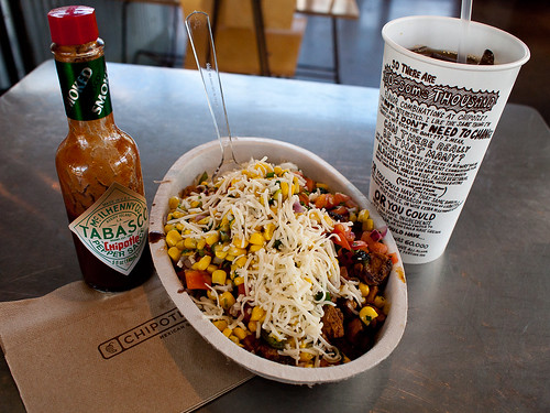
Chipotlé Mexican Grill, Chicken Burrito Bowl
My typical meal, a chicken burrito bowl with Chipotlé Tobasco sauce.
(University Blvd location)

While I believe everything is good to eat, my regular meal is a chicken burrito bowl with rice and black beans, grilled bell peppers with onions, mild salsa, corn salsa, and a little sprinkle of cheese. I try to make it healthy and save about 200 calories by not getting a regular burrito with a tortilla, as well as leaving off the sour cream and guacamole. Besides, the burrito bowl is the best deal in the house, giving more burrito contents than a regular wrapped burrito. That huge bowl full of food with a regular ice tea (unsweetened) sets me back one penny less than $8.

Chipotlé might not be clase alta for some, but for me it fits quite well into a busy schedule and a need to avoid the all-to-typical American-style fried fast food. The only other fast casual dining eatery worth eating at (when I'm not eating leftovers for lunch) is Greens and Grille (which I hope to review soon as well). Chipotlé Mexican Grill might not be the cheapest, but unfortunately in this country good healthy food costs a little more. For me, though, it's well worth it.

contact me...

You can click here for Matthew's e-mail address.