2011-01-30

The (Yellow) Pod (camera beanbag)


Concept:  2 out of 5
Execution:  3 out of 5
Yeah, but: THE annoying website needs to be forgiven.

The Long Version: Beanbags aren't exciting, and the Pod is no exception. I bought mine many years ago and have only used it sporadically since then. In fact I've forgotten that I own it for months or years at a time, only to rediscover it at the back of the cabinet, look at it, and then put it away again.

As a review, this must not sound too promising, but my point is that sometimes I'm not too bright.

I didn't have it with me last christmas, when I had to balance a camera on the back of a couch because I was away from home and neither of my two (2) Gorillapods would fit in my camera bag. I didn't have it when I was on a trip with my long Sigma 180 Macro lens, where its vinyl base wouldn't have been affected by the dampness left over from a weekend of drizzle. And I haven't thought to use it for any of the impromptu product photography for this blog, even though holding the camera still(er) and just a little above the table is usually what I need to do.

Despite its unglamorous and unassuming nature, the Pod can be a handy thing to have.

Yellow Pod holding a Hasselblad and CF 150mm f/4 lens

The Pod is a little different from a conventional beanbag, which is usually nothing more than a small lumpy pillow. Instead the Pod is a squat fabric cylinder with a tough vinyl-ish bottom and a threaded mounting screw on the top. It can be used as a monopod replacement, stabilizing the camera to give an extra couple of stops on a long lens or slow shutter, where it has the combination of movement and stability that you'd get from a squishy ballhead. Any beanbag is just an intermediary between the camera and its improvised support, and for this job the Pod doesn't need to be large since it stays with the camera as it moves.

But if the camera is balanced properly, the Pod is also a light-weight travel-tripod replacement, able to hold the camera securely on rough or sloped surfaces as much as 30 degrees off horizontal. To this end there are a half-dozen different models with various sizes and mounting methods, but the one that works for an SLR with a prime lens may not suit the same camera with a basic zoom. Of course there's no rule that says that you must have the camera attached to the tripod mount, but if the Pod's going to be used with one particular camera and lens, it makes sense to get the right one. Choose carefully to avoid disappointment – ideally from a local store with a good exchange policy.


In a possible nod to its compatriot, the Robertson screwdriver, each model is identified by its colour. The yellow version that I use is the smallest size with a centered tripod screw; the Red is their medium size and is probably the best general-purpose pod for cameras that balance near their tripod mount. The most-popular Green model has an offset tripod screw for cameras with longer lenses. Black is their biggest size - like the screwdriver - and it would make an interesting companion for my GX680. Blue and Silver round out the collection, and like the Green they feature off-centre mounting for various sizes of camera.

The bottom of the Pod is tough and grippy, and has a seam that's secured with a velcro-like material. Inside are billions of little plastic pellets that are just waiting to escape, so don't open it unless you have to. But if you're traveling and space is critical, this gives the option of carrying it empty and filling it with sand, dried beans, or little plastic pellets once you arrive. I've had to open mine up and empty it so that I could tighten the mounting screw, which had retracted into the Pod over its years of occasional use. A #2 Philips screwdriver was all I needed to snug it back up to the solid plastic disk that forms the camera platform, and with patience I was able to get almost all of those little plastic beads back in.

I've brought my Pod out of retirement because it's a good match to my little travel camera, and it lets me take photos in places that wouldn't allow tripods. Now that I'm using it again I can see many times when it would have been helpful in the past, and I don't think I'll make those mistakes again. I'm not going to run out to buy any of the other sizes, but I have to admit that I've been considering it, if only a little. Having a Red or Black one would be pretty handy.


last updated 30 jan 2011

2011-01-26

The Robertson Screwdriver


Concept: 5 out of 5
Execution: 3 out of 5
Yeah, but: No relation.

The Long Version: The Robertson screwdriver is a Canadian touchstone, somewhat like the RCMP, moose, and poutine. As something that's demonstrably superior but under-appreciated across the rest of the world, well, if it wasn't Canadian by birth we'd probably adopt it.

We're funny that way.

The Robertson screwdriver has a square head that provides an exceptional grip on the screw, but without the over-tightened bite of its American replicas. Like Helvetica and Arial, the Robertson and square-drive screwdrivers look a lot alike, but where one is a refined design of elegance and function, the other one just looks similar. A proper Robertson screw will cling to the driver without it being magnetized, and yet it disengages smoothly when the job is done. There's enough power in the tapered fit that a Robertson driver will still extract a screw that's been painted into place, and they don't strip or jump the way Philips screwdrivers will.


Robertson sizes are denoted with colours instead of numbers. The medium-size that's most common is red; anyone who calls this a "#2 Robertson" deserves arched eyebrows and a thorough looking-down-on. Black is the largest size, with green being smaller; yellow and orange are smaller still but much less common. Typically the handles of a fixed-bit driver will show the colour of the size, while interchangeable bits should be painted to suit. Picking the right driver out of a clutter of tools is quick and easy.

While they're ideal for almost everything, Robertson screws are most likely to be found in woodworking and electrical - if you're lucky enough to find them at all. In America and elsewhere in the world these are either unknown or a small niche (rhymes with quiche) for specialty manufacturers. Even in the country where they were born over a hundred years ago, the genuine Canadian invention is almost completely subsumed within the sea of knock-off products imported from all over the world.

It's hard to get more Canadian than that.


last updated 23 feb 2013

2011-01-18

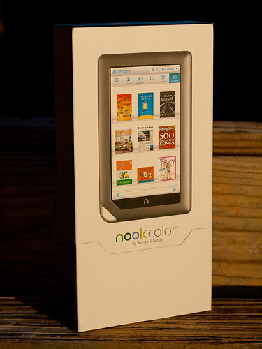
Barnes and Noble Nook Color

Olympus Nook

Concept: 3 out of 5
Execution: 1 out of 5
Yeah, but: Paper publishing is preferable to the Color Nook.

The Long Version: There's an interesting article on the NPR website, "Digital Divide Propels Barnes & Noble Past Rival", in which the author writes glowingly of the Barnes & Noble Nook Color and how it's opened up a gap between it and it's nearest brick-and-mortar rival, Borders. Based on my experience and the experience of my wife, the Nook Color is barely usable and not worth consideration in its present state. Which makes me wonder if the author actually used the Nook Color. I sincerely doubt Border's management will loose much sleep over the Nook Color, as the NPR article would have you believe.

It All Started...

My wife and I decided to give one another a Nook Color for Christmas. My wife is a veracious reader, and after 25-plus years in our current house, she's filled shelves, closets, and boxes with books of nearly every description. She's purchased so many books over the years that she could open her own (used) book store.

She wanted a Nook Color so she could ostensibly switch to e-books and save the space regular books consume. She, in turn, wanted to give me a Nook Color so I'd keep my hands off of her Nook Color; after nearly 30 years, she knows me all too well for the geek that I am, and she didn't want me tinkering about with hers. Her gift of a Nook Color to me was as much a defensive act as an act of love.

The decision to purchase the Nook Color was easy for us to make; we were drawn to it by its provenance and cost. We've been satisfied Barnes & Noble customers for many years, and have been a member of the Barnes & Noble discount club for almost as long as we've been customers. With that kind of good-will towards Barnes & Noble it was easy for us to purchase an e-reader made and sold by them. And at a cost of $250 the Nook Color is one of the cheapest color tablets on the market, far cheaper than the Apple iPad. It seemed like a very safe purchase to make.

When we purchased our Nook Colors I purchased mine on-line from Barnes & Noble while my wife purchased her's from Amazon. The Amazon purchase turned out to be problematic because of Amazon's 14-day return policy. Barnes & Noble had a much more customer-friendly return policy; their web site stated that they would accept any Nook Color return, if purchased after November 30th, opened or unopened, until January 31st, 2011.

Our Nooks were purchased on December 14th. We opened them Christmas day. After two weeks of working with the Nooks we decided to return them both by January 10th. Because of Amazon's return policy we were out of Amazon's return policy window. It is to the credit of Barnes & Noble that they accepted, for return, the Nook Color purchased through Amazon, and for that I am most grateful. But let me back up a bit and recount our experiences with the Nook Color and why we returned them.

Technical Specifications

The Color Nook is a color screen tablet computer. It is built around an 800 MHz ARM-core-A8-based Texas Instruments OMAP3621 processor with 512MB DRAM and 8GB of flash storage. The front contains a 7 inch diagonal 1024 by 600 pixel resolution capacitive multitouch color screen that is supposedly capable of displaying 16 million unique colors.

The operating system running on the Nook Color is based on Android 2.1, with extensions added by Barnes & Noble for the Nook Color. The specific Barnes & Noble OS version tested with the Nook Colors we had was 1.0.1. TheNooks initially shipped to us with version 1.0.0 installed. I downloaded the 1.0.1 version from Barnes & Noble and upgraded both via side-loading.

The Nook Color is powered by a rechargeable NiMh battery, which gave a practical limit of between five and six hours operation using the 1.0.1 OS release with WiFi enabled.

The exterior controls consist of an on/off push button on the top left, a pair of volume control push buttons on the top right, and a single control on the lower front in the shape of an inverted 'u', but meant to represent a lowercase 'n'. At the bottom edge is an industry-standard miniature headphone jack and a sub-miniature USB connector for both data and charging.

Presentation

If there's one lesson Apple's success has taught the industry, it's that the initial packaging presentation is important to establishing overall customer satisfaction. Apple's packaging presentation is legendary. B&N's is not quite as legendary, but it's still quite nice and earns points for not having required as many dead trees as some of Apple's more elaborate packaging excesses.

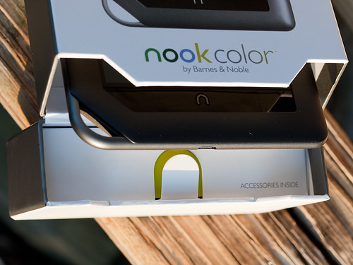
Color Nook Accessories Location

The Nook Color's box is simple to open. There are small magnets embedded in the lid and the opening to keep the lid closed or, when open, flat against the back of the box. The lid doesn't flop around.

In the lid itself is a simple box that is easy to pull out and open. It contains the Nook's four foot long USB to micro USB cable and a small wall wart to charge the Nook's internal battery. When the cable is not being used for data access, it plugs into the USB-style slot on the wall wart for charging.

Many more points are earned by the cable. The Nook use a standard micro USB connector, the same as many contemporary cell phones now use. It's a foot longer than an equivalent Apple cable (the Apple cable uses a proprietary connector into the iDevice), and it's a lot thicker and more robust. When not used to charge the Nook, the USB cable can be used to connect to a PC or a Mac and access the Nook's internal flash memory.

That's right; the Nook acts like an 8GB thumb drive when connected, and it's very simple to drag and drop content such as JPEGs, MP3s, and other electronic content to and from the Nook. From a data perspective, it's an open device. More points to the Nook for being so open.

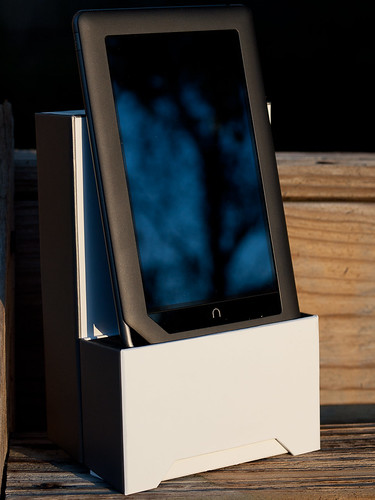
Color Nook in Case Holder

What's clever about the box is that the end of the lid contains a foam insert with a slot cut out the same width as the Nook. With the box opened it acts as a simple holder for the Nook.

Operations

With all those good points, why were the Nooks returned? The Nooks were returned because their performance was awful. Whether it was trying to flip between the virtual pages of an electronic book, or trying to scroll a web page using the built-in browser, or trying to interact with the Nook in general, the Nook would either freeze during an operation, inconsistently recognize finger interactions, or scroll in a very choppy and annoying fashion.

In stark contrast, any iDevice you can purchase from Apple is buttery smooth in its operations and highly consistent and predictable in its interactions.

My wife is a very forgiving woman, and will blame herself for a device's intransigence before she blames the device, but after two weeks of fighting her Nook she realized it wasn't her and finally had me return it.

My experiences were far worse. Not only was performance choppy, but I lost track of the number of times I locked my Nook up with the built-in web browser. Every time the Nook locked, I had to hold down the on/off button to force the Nook to power down completely and reset the device. Then I'd power it back up again.

Other issues I had concerned it's inability to read any PDF I tried to load on the device, and the limited color range for JPEG images. The Nook would appear to open PDF files, and display the front page, but it would never display any other page in the document.

Remember those 16 million colors the Nook is supposed to display? The current Nook Color will only display a far smaller number; JPEGs that display smooth tonalities on most other devices (iDevice, Mac or PC) show up as step-wise color messes on the Nook, with dark areas completely black and light areas blown out.

To add insult to injury, the device I gave to my wife had to be exchanged December 27th when the Nook stopped playing any audio. My wife had set up an account with Pandora, and was enjoying the streaming music when it simple stopped playing. No reseting of the Nook would correct the problem; in the end we had to drive to a downtown Orlando store and exchange it.

Return and Final Comments

Let me take a moment to praise a local Orlando member of Barnes & Nobles staff; Tammy Randoph. Tammy works at our local Barnes & Noble at Sandlake Road and Dr. Phillips Blvd. When it came time to return my wife's Nook, Tammy credited our account for the device, even though we didn't have the receipt and it wasn't purchased at her store. It turned out that exchanging my wife's Nook "reset the clock" and removed the initial purchase record. According to Barnes & Noble's system it appeared as if her Nook was actually purchased on December 27th.

The other Nook had to be shipped back (free shipping) to Barnes & Noble for a full refund.

It's excellent customer service that makes us loyal Barnes & Noble customers, in spite of our negative experience with the Nooks.

The on-line press has been reporting since December 2010 that Barnes & Noble was near to releasing an Android 2.2 version for the Nook Color that would address most, if not all the issues we encountered with our copies. But as I was standing at the local Barnes & Noble to return my wife's Nook, one of the staff (not Tammy) remarked that if we waited until February, Barnes & Noble would release Android 2.2. When I realized this magic release was sliding to the right, I finally and completely gave up on this version of the Nook. I wasn't going to wait for a new OS release that might, or might not, make the Nook Color the type of device it should have been at its release.

I continue to be a loyal Barnes & Noble customer, and still enjoy the regular stop by the book store to browse and purchase books. But it's going to take a lot of work on the software side before I'll consider purchasing another Nook Color.
last updated 18 january 2011

2011-01-16

Fujifilm GX680iii


Concept: 4 out of 5
Execution: 4 out of 5
Yeah, but: It's the Chuck Norris of cameras.

The Long Version: You can tell just by looking at the Fujifilm GX680 that it's one of those cameras that's going to kick your ass. Sure as God made green apples, it's inevitable. Ready to shoot it weighs ten pounds, and that's not counting the tripod. The lens is mounted on a front standard that can do compound swings and shifts in any direction; the additional 80mm extension rails on the front of the camera lets it focus closely enough to do near-macro work with many of its lenses. With those rails and an eye-level viewfinder, the box that would hold it snugly could comfortably fit ten D3x's, yet it can be broken down into five major components in seconds. It even has a bubble level built into the top of it. An SLR doesn't get more hard-core than that.

Garry Winogrand famously said that he takes photos to see what they look like. In the four months that I've owned my GX680, I've been compelled to see what things look like when photographed through it. It's such an extreme camera that it dictates a certain way of working, and the camera will only take the kind of photos that it likes to take. Forget about sharp close-ups of hockey players on a breakaway, or subtle street photos while rolling along in a crowd. But when I'm willing to rethink the kind of photo that I want to achieve, there's very little that I wouldn't want to use the GX680 for. Its image quality and control are addictive.

Unfortunately the 680 is such a massive camera that it needs a reason to leave the house, and it's so slow to set up that it can't be used spontaneously. The logistics of having only nine exposures on a roll of 120 film requires deliberation and planning. I'd like to say that using the Fuji takes longer to describe than to do, but it really doesn't. A 'quick' setup for one of my photos with the GX680 takes at least five minutes. Set the tripod, establish the rough composition and focus, level the camera, fine-tune the composition, relevel the camera; refine the focus, adjust the perspective controls, swing the plane of focus into place, and refine the composition, camera position, and focus once more; lock the focus knob in place. Dig out the trusty hand-held light meter, because the 680 doesn't have one built in, take a couple of exposure readings and set the shutter speed and aperture. Fold down the viewfinder, turn the camera on, and lock up the mirror; take three deep breaths and gently press the shutter switch. Flip the mirror down, turn off the camera, centre and lock the lens movements, unlock the focus knob, zero the focus, and lock the knob again before moving on. Using the camera is physically and mentally exhausting.

'Steel in XP2' (see bigger)

But in exchange for all of that, the GX680 delivers a negative five times the size of 35mm film. The classic Hasselblad medium format camera creates exceptional images with its 2¼" square negative, but the GX680 captures 35% more surface area. And because the GX680 has a rotating back that captures a 4x3 ratio, it's a natural fit with minimal cropping for either a vertical or horizontal print. There are some excellent articles about medium format film sizes on photo.net (where I first learned that the GX680 exists) and on Roger and Frances' excellent Photo School website, but in a nutshell, the 6x8 nominal - 56x76mm actual - size is both one of the largest for rollfilm cameras and an excellent match for standard paper sizes. There are masks available to convert the 680 mk3 into a 6x7, 6x6, or 645 camera, but conserving film by capturing smaller negatives with the biggest SLR ever produced is missing the point.

While it doesn't boast as much perspective control as a technical large format camera, the Fuji GX680 has a good degree of their most important movements. In exchange, it gains the speed and convenience of rollfilm - everything's relative - and the ability to view and compose without having to take off the back. So while it doesn't have the sheer surface area of a large format negative, it's also true that there's always something bigger out there. The GX680III gives the automation of an SLR, including motorized film winding and advance, a last-shot warning, and fully electronic controls that can be driven from a mere six AA batteries that last a remarkably long time. As a 'system' camera, it has interchangeable film backs, and can use a waist-level finder, a 90 degree eye-level prism finder, or a metering prism that also allows aperture-priority exposure.


Whenever possible I'll use the 'waist level' finder, which is a collapsable hood with a magnifying eyepiece. The view is reversed, so moving the camera while composing can be disorienting; to shift the finder image to the right, the camera needs to swing left. I actually have used the 680 without a tripod, but framing was hopeless as I swayed around like a drunken dancer. I'll use the eye-level finder when the camera needs to be too high for me to view the top-mounted screen directly, but I'm not as confident when focusing with it. It does flip the image horizontally, so it does feel more natural to compose with it on the camera. Life's a barter.

I've never used the eye-level finder with a built-in light meter, and don't feel the need to find one. If the mirror is locked up it cuts off the light that the auto-exposure system needs, rendering its advantage moot. Since the camera is feeding an 8x8cm area with light, that's a mighty big mirror to have flying around at the moment of exposure, and I use the MLU switch whenever possible. Given the tremendous exposure latitude of good negative films, using a hand-held meter isn't all that difficult even in changing light. Since the shutter speeds are controlled in whole stops (8s to 1/400) and that the aperture only has whole click-stops, I habitually err on the side of overexposure and everything works out fine. Negative film is very forgiving.


The Fujifilm GX680iii has taught me a lot about photography. Beyond the expected lessons from working more slowly with exceptional control, I also learned that I needed a new tripod and a backpack. I've shifted the 680 from a Gitzo Explorer 2220 with a Manfrotto 410 Geared Head (above), which is wonderful but not strong enough, to a Berlebach 3032 with a Manfrotto levelling plate (lead photo). I've often read that this beast is a 'studio camera' because it's too heavy to carry, and there's a certain truth to that even though I choose to ignore it. I finally found a backpack big enough to carry it (Kata "Source" 261PL, reviewed), and while the bag itself is quite light, my total kit is easily thirty pounds. That includes only two lenses, the 80/5.6 and 210/5.6, the eye-level finder, two backs, and the tripod; odds and ends like a Sekonic 308 meter and film really don't add much to the total load.

Carrying the camera for a day isn't really a sensible option. A recent outing to the local Zoo involved many places to put the camera down, which made it tolerable but tiring. As the weather improves I'll be taking it for a couple of long walks, but as much as I adore the camera and love its image quality I'm resigning myself to the idea that I won't be able to travel between cities with it if there's a bus or a plane involved. It's not that I ever expected to be able to, as it's nowhere near as convenient to carry as my rangefinder, but the GX680 is addictive in a way that I never thought it would be.


Part of the fun of having a system camera is being able to dress it up. I have three different bellows for the GX680, and all of them appear on the camera for the hero shots in this review. The lead photo shows the standard wide bellows, which gives more room for lens movements than the original. It's long enough that it can reach the end of the (optional) 40mm extension rails, but for maximum close focusing the extended bellows and 80mm rails are needed. The tradeoff is that the extra material stops wide lenses like my 80/5.6 (35-ish in 35mm) from focusing to infinity. Depending on what I'm doing I might have to change bellows as well as lenses, which is a long way from using an all-in-one superzoom on a DSLR, but in practice it isn't that big a deal. The latches are a little fiddly, but it's easier than tying a windsor knot.

The standard bellows that came with the camera are just a placeholder until one of the better ones can be put on. It works for focusing and some movement, but it doesn't do justice to the camera. It can be seen on the camera at the very bottom of this review, where the GX680 is sitting next to my D700 with its 85mm tilt/shift lens.

One accessory that I don't yet have is a cable release; I'm looking for one but not at the expense of a great deal of time or effort. While it should theoretically improve sharpness, the shutter switch (light grey, toward the bottom-front of the left side of the camera body, and visible in most of these profile photos) is activated with a very light touch that can hardly have much effect on the camera when it's securely bolted to a heavy tripod. The sensitivity and placement of the switch is why I only keep the camera powered up when I'm about to take a picture. At about a dollar a frame, hitting the shutter by accident is not funny. The main advantage that I see for a cable release is simply better ergonomics, letting me hold a more comfortable position - sitting down, if possible - while I wait for the photo to be perfect.


Photography with a small-format camera can be a lot like hunting, with the photographer moving from place to place searching for the elusive image, but using such a big camera on a tripod is more like hanging out in a deer stand. It often involves making minor adjustments in a likely spot and then waiting for the right moment. I gave a squirrel the fright of its life when I took the photo "steel in XP2" that starts this review. It was a windy day, so I needed to wait until the wind stopped moving the loose steel band that I had focused on; I stood there so long that the street-savvy tree rat had no idea that I was there. They're not too bright, but I was still impressed.

One side effect of using such a large format is that the depth of field is relatively shallow. F/8 will look like f/4 on a 'full-frame' camera, either digital or film, f/2.8 on a 1.5x crop digital, or f/2 on a 2x crop camera like my Olympus E-1 or Panasonic GH1. But aperture is an exposure control, not a focusing adjustment: a tripod would typically be needed just because of the resulting slow shutter speeds, quite regardless of its benefits for composition and support. I prefer an extensive depth of field, so given the uncertainty of swinging manual focus with less than perfect vision, I frequently work around f/22-f/32. Even in broad daylight at my typical iso320, I've never used the Fuji's maximum 1/400 shutter speed.

I have bumped into the eight second minimum shutter speed. It happened when I was working indoors and at a close focusing distance with only marginal early-morning natural light, but that situation is so carefully described that the solution suggests itself.


There is both a hotshoe and a PC terminal on the camera, making it possible to work with studio lights or speedlights. The leaf shutter means that flashes can be used with shutter speeds up to the camera's maximum 1/400 of a second, making it relatively easy to control the ambient light. The GX680iii also has a warning buzzer that can be set to sound if it doesn't think there was enough light to create an exposure, which would happen if the strobes don't fire properly. All told it is a very capable studio camera, but my skills at visualizing light keeps me working with constant light sources for now. There's also a polaroid back for doing test exposures, but that's a solution with its own set of difficulties.

The Fujifilm GX680 was made in four variations, marked with roman numerals i through iii, and iiis. The "S" variant is the same as the III but without the movements; as nice as the GX680 is, I don't see the point of saving a pound or two by removing the one really distinctive ability that it has. The i and ii variants are mostly different from the iii by running on proprietary rechargeable batteries, which is a problem as the cameras get older. The GX680III can use a combination of CR2 and CR123 lithium batteries in the back and body, which would probably last forever, but the need for those expensive cells is superseded by the 6xAA piggyback pack on the left side of the camera. Reportedly these also work on earlier models, which are much more affordable than the newer iii's on the second-hand market. These cameras have been discontinued for many years, so the likelihood of finding one as new-old-stock in a store is pretty slim, but some of the better supply houses still rent them and may sell some of their extra accessories.


The Fujifilm GX680III is my first experience with medium format film, and while it looks intimidating, both learning the new format and assembling a true system camera has been less frightening than it appears. Part of that is from my introduction to lens movements via the Nikon 85/2.8 PC-E lens, which is spanked by what the 680 can do, but the theory's the same. I also have to give thanks for Danny Burk's excellent 680 review, which provided me with the best information about the camera, and for the whole Photo School site by Roger (Hicks) and Frances (Schultz), which has single-handedly re-educated me after years of digital photography. Cameras with movements are nothing new, and 120 rollfilm was considered an amateur format a century ago. It's not as standardized as we're used to these days, but it's not difficult.

One significant advantage to medium format is how incredibly forgiving the huge negatives are. For detail, tonal range, and exposure latitude my D700 simply can't compete, and there's no need to go as extreme as a GX680iii to get those advantages. A basic medium format camera kit can usually be found for a few hundred dollars, and any flatbed scanner with a transparency adapter will pull out plenty of detail for the largest inkjet prints that anyone's likely to make at home. For those really great images, a professional scan can enable a print that's measured in feet instead of inches. Of course the ongoing costs of film are more tangible than those of digital, but how much is a three-year-old consumer dSLR worth today? With older film cameras depreciation is essentially zero, and there's thirty or forty year's worth of them to be found second-hand. I love my GX680, and try to use it whenever I can, but there are times when its oversized personality makes it impractical despite all of its advantages. I've been thinking of the 680 as my 'first' MF camera for a while now, and soon a smaller travel camera will be joining it.


There is no perfect camera. Everything's a compromise, decisions have to be made, and priorities must be set. The beauty of the Fujifilm GX680iii is that its design decisions are massively obvious; it's a camera that's remarkably free of the fine distinctions that plague decision making. There are systems that offer some of its abilities, but nothing wraps it up in a package like this one. The Mamiya RB/RZ gets most of the way there but without offering lens movements; large format technical cameras may actually be lighter with larger negatives and more control, but they don't have the SLR's direct view and (relatively) inexpensive and abundant film.

The Fujifilm GX680 is ten pounds of pure awesomeness. Even among its closest relatives, this behemoth stands apart. Compared to the best small format film cameras, its image quality is unbeatable. Next to something like the D700+85PC-E, the flexibility of its movements puts the shift lens to shame; the digital's exposure latitude and detail are also exceeded by the film camera. As a photographic device this Fuji SLR is so extreme that it's absurd, and I wouldn't want it any other way. It's the only camera that can count to infinity - twice.


Updated, jan 2012: to mark the one-year anniversary of writing this awesome camera's review, I've followed up with a review of the GX680's little brother, the GA645Zi. As the name implies, it's a 645 format camera that has absolutely nothing in common with the big GX, except that they both take 120 format film and were made by Fujifilm at roughly the same time.

Major update, june 2012: UK photographer Ken Kirkword has written a fantastic addition to the story of the Fujifilm GX680, which I've had the opportunity to publish as a guest post here. Absolutely essential reading for anyone who's interested enough to make it all the way to the end of this review. Ken Kirkwood on the GX680 – check it out.


2011-01-14

The Photographer, by Dider Lefèvre & Emmanuel Guibert


Concept: 4 out of 5
Execution: 3 out of 5
Yeah, but: The paperback cover was clearly designed by committee

The Long Version:  The Photographer documents photojournalist Didier Lefèvre’s 1986 journey in the highlands of Afghanistan through a fantastic and unique collection of words, photographs and illustrations.

Like soccer, graphic novels have never really caught-on to the mainstream in North America.  People are aware of their existence - and of course there are collectives of devotees and fanatics - but regardless of their staggering popularity outside the continent, the popular forms of entertainment simply lie elsewhere.

In many parts of the world it is understood that complex stories and mature themes can be brilliantly expressed through the combination of words and illustration in a graphic novel, but it’s been an uphill battle for acceptance in North America where there’s still a juvenile stigma attached to reading them. Most people would feel awkward to be seen on public transit reading these large-format comics for adults, with their brightly coloured drawings and cartoon speech bubbles.


This may explain the ugly paperback cover of the English edition. It’s a crowded mess of image and text, far removed from the elegant simplicity of the original French version. The back cover has been plastered with accolades from reputable American sources to lend credibility and convince buyers that this is not an Archie Double Digest.

Didier Lefèvre’s story takes place in the highlands of northern Afghanistan in 1986, at the time when the Soviet’s Cold War expansionism began to break. 


At this time Médecins Sans Frontières/Doctors Without Borders (MSF) was entering the country on foot to build a tiny mountain hospital for the local civilians, and Lefèvre accompanied the doctors as a photojournalist to document the process.


The war and the politics of the time serve as a backdrop rather than a subject. This appropriately reflects Lefèvre’s then limited knowledge of the astoundingly complex situation. Lefèvre was young and the reportage for MSF was his first major assignment. 

The story begins while he is packing to leave Paris, then briskly carries us to the middle-east where we are introduced to the characters, the culture and the mission. It’s an on-the-ground journal of the photographer’s experiences while travelling by foot and by mule through the heat of the valleys and the ice and snow of the mountain passes.
We listen in to conversations and see the experiences of everyday life, of photography, of medicine and surgery, of the internal politics of the organization, and of the inevitble cultural clashes. 


The collaboration of Lefèvre’s memories told through Guibert’s writing gives the story an objective view of the situation, told with the perspective of hindsight. Lefèvre does not go easy on himself or others when rash decisions were made, and there’s a clear honesty in his words.

Much of the book uses the original photographs of Lefèvre as wordless panels seamlessly placed in the illustrated narrative. Often the images appear as photographic contact sheets, with the sprocket holes of the Ilford HP5 visible under the red grease pencil of his selects. 


Emmanuel Guibert’s ink-dropper illustrations are the perfect foil to the realism of the photographs.The illustrations will often provide a reverse angle view of the action, or propel the story forward by bridging the scenes during which Lefèvre’s camera was put away.
The photographs will often snap you back to reality after a full-page of illustration, reminding you that this really did happen.
It’s especially rewarding to recognise specific elements from the illustrations in the photographs, a distinctly shaped rock, some clothing, a man’s rifle.


Few images of Lefèvre exist - as he was the photographer - so Guibert has filled the gaps with realistic renditions of Lefèvre and his habits. The official website shows a video of Lefèvre changing the film and lenses of his battered Nikon and Leica cameras. This was used by Guibert as a reference for his many illlustrations of Lefèvre in action.


The subtle natural colouring and page layout of Frédéric Lemercier is the glue that seamlessly binds together the contrasting styles of illustration and photography. The steel blue of the sky darkens from panel to panel as night falls or day breaks. An illicit border crossing under the cover of darkness is exactly as you would see it; stumbling through the boulders you can barely make out the forms of the other people against the inky sky.


The Photographer is a joy to read. By turns; exciting, exasperating, emotional, funny. Unlike the mystery of Steve McCurry’s famous image Afghan Girl, The Photographer provides a context for each photograph that cannot be captured in newspapers or magazines.
In Seeing each of Lefèvre’s photos for the first time we know the characters, we appreciate the location, we understand the situation.


Anthony writes about overland travel photography at www.motojournalism.com

2011-01-12

Ultra Fleecy Fabric Softener


Concept:  3 out of 5
Execution:  1 out of 5
Yeah, but:  It's so fluffy!

The Long Version: Perhaps I shouldn't be so surprised at how hard it is to find decent information about fabric softener. After all, it's an industry worth a huge amount of money that involves complex chemicals and heavy perfumes. On one side of the information chasm we have the manufacturers whose only advice is how to use more of their product, while their adversaries love the clichĂ© "chemical-laden". That's a scary phrase that's completely meaningless, as even a glass of pure distilled water is laden with hydrogen and oxygen, which are combustible, reactive, and/or poisonous chemicals that can kill you if not handled correctly.

The foundation of most softeners, ditallow dimethyl ammonium chloride (DTDMAC) (pdf) certainly isn't something I'd want to drink. Norway has it on their list of priority substances to reduce, a list that include[s] substances that are persistent and bioaccumulative, that have serious long-term health effects, or that show high ecotoxicity. The additional additives and other ingredients almost certainly don't improve matters; there's no doubt in my mind that this isn't something I should enjoy pouring down the drain. I compensate for that by adding it only when it will actually be useful - I wash my shirts separately from my jeans in the world's smallest front-load washer - and by using about a fifth of the recommended amount. Even with that level of moderation it still takes care of the static electricity that's endemic in winter.


But in a market filled with dubious information and spin, sometimes companies rise to the level of art. All bottles of fabric softener have this handy disclaimer on their backs. Essentially, fabric softeners increase fluffiness and flammability, so it should not be used on inherently fluffy fabrics like fleece and terry cloth, or on anything that needs to be treated for flame-resistance, such as "children's sleepwear". Yet the photo on the front of the bottle that I bought looks like a scary aryan robo-baby wrapped up in a fluffy fleece blanket. I have to admit that this absurdity is the only reason why I picked this particular brand out of the noise of indistinguishable products.

WTF, Ultra Fleecy?


last updated 12 jan 2011

2011-01-06

Carl Zeiss f/4 85mm Tele-Tessar Lens


Concept:  2 out of 5
Execution:  3 out of 5
Yeah, but:  It fills a need.

The Long Version: There are certain things that you can assume with a Carl Zeiss lens, and despite its relative affordability, there's not much point putting the loupe to negatives shot with the 85mm tele-tessar. The calculated MTF (pdf) is without reproach, there's about one stop of falloff in the extreme corners when wide open, and it has so little geometric distortion that I can't tell if it's barrel or pincushion. There's never been a time when I wished for better optical performance from the lens, either on my film ZM Ikon or with my GH1 on an adapter.

do you know…?

My photography typically isolates details from flat surfaces, so the lens characteristics that matter most to me are geometric fidelity and even sharpness across the frame. I'm not particularly concerned with 'bokeh' or the ability to render a shallow depth of field, and typically use the smallest aperture that will give me an adequate shutter speed. Please keep in mind that the clinical and impersonal photos that I like to take affect my perspectives: if you, gentle reader, are a classical portraitist or a spontaneous street shooter, your needs are different from mine.

I rarely write disclaimers for my reviews, but I have to say upfront that this isn't an overly glowing report despite the unquestionable technical excellence of its subject. I do really like using the lens and seeing its results, but the 4/85 just isn't a landmark lens. It doesn't make or break the system; I doubt that anyone has ever bought a rangefinder just so that they can use it. It's certainly no 35-100mm f/2, which remains the single best reason to own an Olympus SLR. I'd miss the tele-tessar quite badly if it was gone, as it's an excellent Carl Zeiss lens, but it's not one that I can be passionate about.

tractor beam

By rangefinder standards the 4/85 is a fairly large lens. It projects three inches from the front of the camera without the hood, and hits 4.5" when that $84 accessory is added on. The hood creeps into the frame lines when the lens is focused down to three metres, but even when focused to its minimum 0.9m it only lightly blocks a corner of the active frame. Without the hood the lens stays clear of the frame at any focusing distance. The perfectly cylindrical hood attaches with a bayonet, leaving the 43mm threads clear for filters, and while it does fit over the lens backwards the hood doesn't lock into place when it's reversed. The lens and hood are both metal and are beautifully built, but Zeiss lens caps are unquestionably the worst I've ever seen.

The 85 f/4 has a focusing scale with depth of field marks for f/8, 16, and 22. Because of the length of the lens, the focusing collar is quite generous, but it lacks the nub that most ZM lenses have. The aperture indices are a long way away at the front of the lens, but the entire inner barrel of the lens rotates to make setting the aperture quite convenient. This is typical for a ZM lens, although having almost an inch of smooth barrel between the focusing collar and the front of the lens makes it very noticeable.

Fire, 3 Jan 2011

It's easy to tell when forum discussions and opinions about the 85mm tele-tessar were written. If there's a lot of enthusiasm, then the discussion started right after the initial product announcement. If there's gnashing of teeth and rending of garments, then it came after the f/4 maximum aperture was revealed. If a thread is full of people suggesting other lenses when someone asks about the 4/85, then it's contemporary. The thoughtful and practical assessment that usually comes with experience is almost entirely absent. It seems like almost nobody actually owns one of these lenses – my serial number ends in "002", and sometimes I wonder if they're selling them sequentially.


I do have a certain empathy for those who dismiss the tele-tessar because it's a 'slow' lens. My favourite colour film is Kodak's fidgety iso100 Ektar, and the f/4 aperture means that my shutter speed can get into trouble just by photographing into shadows on a sunny day. Using XP2 at iso 320 is better, but when I know that I'll be using the 4/85 as my main lens I'll switch to Fujifilm's Press 1600 and rate it at 1250. That gives me the freedom to use the middle apertures without having to look for the meter. While holding a rangefinder really is easier than an SLR, I have lost the occasional frame to camera shake.


Rush Lane

But there's another way that the f/4 aperture is limiting, which is very important for some people. Without razor-thin depth of field it's hard to show that someone has spent more money than other photographers, making this lens unquestionably inferior to the Carl Zeiss 85mm f/2 sonnar. True, some people do very well by chasing the fuzzy-eared portrait fashion, but the Canon 85/1.2 on a 5D will always be the king of that look, putting it beyond my concern.

Sure, if the Zeiss 4/85 could be made into a faster lens without changing its size, weight, cost, or quality, I'd buy one. But that's not the lens that we have in the 4/85, and its somewhat modest aperture is a practical compromise considering its other excellent qualities. I have used the tele-tessar's f/2 sonnar stablemate, and despite the appeal of having two extra stops of light, I might not choose one even if the extra cost wasn't an issue. Like a thoroughbred racehorse, it's absolutely beautiful and majestic, but who has the room to store a horse these days?

Transportation

The unfortunate reality is that the 85mm focal length isn't playing to the M-mount's strengths. The ZM Zeiss Ikon is one of the very best rangefinders for accurately focusing a long lens, but just about any SLR will do a significantly better job. With imprecise framing coupled to an unmagnified viewfinder, tele-rangefinder photography leaves an uncomfortable amount of the composition up to chance.

The 4/85 can do some very nice head-and-shoulders portraits. It as the same DOF as an f/2.8 lens on a cropped DSLR body, and the narrow field of view makes it easy to choose the backdrop. But for more casual portraiture my first choice will always be the exceptional 1,5/50mm sonnar. I bought that lens so that a photographer friend could use it for one roll at my wedding, where it produced most of my very favourite images. For general photography RF photographers will typically choose a 50mm or 35mm lens, and while some will go wider as their personal favourite, very few will reach for a short telephoto as their primary glass. My personal 'standard' lens is the Carl Zeiss 2/35 biogon, which just fits me perfectly despite my never liking the Nikon 35/2D on my F100 or D700. Life can be like that sometimes.

Untitled #837

So why did I buy a short telephoto lens when it's neither the best for portraits nor a comfortable general-purpose choice for a rangefinder? Quite frankly, the tele-tessar is an excellent lens to have in the camera bag, and that's where mine happily stays most of the time. The 35/85 combination is a classic two-lens kit, and even though the 35mm will see most of the action the 85mm is occasionally vital. A three-lens outfit will frequently include a short telephoto like the 85 along with a 50mm and a wide-angle lens for the maximum versatility. Because of the nature of rangefinder photography the telephoto will invariably see the least use: if it doesn't, you're using the wrong camera. But as a second or third choice, the CZ 85mm f/4 is exceptional.

Partly because it spends the least time on my Ikon, the 4/85 is the lens that I'm most likely to use on an adapter for my micro-four-thirds GH1. Being able to boost the sensitivity on a digital camera mostly absolves its shutter-speed issues, and improving sensor technology will only make that compromise better. I'll often carry a Zeiss lens instead of the Panasonic 14-140, and my M-to-m4/3 adapter has retired the F-to-m4/3 one that I used for the Nikon 85/1.8D. The tele-tessar is technically, mechanically, and ergonomically better than all of my other telephoto choices, and on a Olympus or Sony body with image stabilization, it would be perfect.


I bought the Carl Zeiss 4/85 fully expecting that it would be my least-used lens. It's an excellent optic, and matches perfectly with the other technician of the CZ-ZM line, the 2/35 Biogon. But even though I gravitate toward telephoto compositions, and love the look of its results, there haven't been any happy surprises with the 4/85. I take just as few photos with it as I expected. Even when I'm making a point of using it – like to gather some images for a review that I've been meaning to write for a couple of months – I find myself illicitly switching to shorter focal lengths. They're simply a better match for a rangefinder camera, and can be used with less concern about the finicky details of composition and shutter speed. But for both versatility and comprehensiveness, the 4/85 t* tele-tessar lens is one that I wouldn't want to be without.

Not every lens can be the one that gets used the most, and that's okay.


last updated 10 jan 2011

contact me...

You can click here for Matthew's e-mail address.