2012-01-29

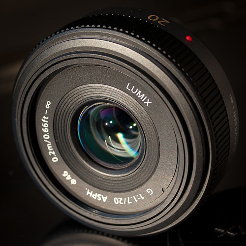
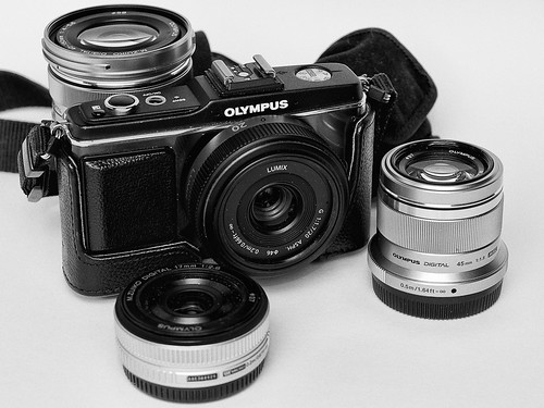
Panasonic Lumix G 20mm F1.7 ASPH.

Panasonic 20mm Side

Concept: 4 out of 5
Execution: 3 out of 5
Yeah, but: So what took me so long?

The Long Version:

This is the second review of this lens. Matthew wrote the first, an excellent review when he purchased his copy over a year and a half ago. Rather than repeat what he wrote, I'll refer you to his review. I'll wait here while you go and read it.

I first considered the 20mm when Matthew wrote his review. Unfortunately the price at that time for the 20mm was its MSRP of $400, or $150 more than the Olympus 17mm. So being the cheap guy that I am I purchased the 17mm and went off happily using it for all sorts of subjects, none the wiser.

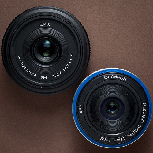
Panasonic 20mm and M.Zuiko 17mm
Panasonic 20mm on the left, Olympus 17mm on the right,
minus its front cosmetic outer ring.

I even wrote a review about the 17mm not long after Matthew wrote his 20mm review, extolling the 17mm's virtues. Over the period I've owned the 17mm I've certainly taken my fair share of photographs with it. Yet, in spite of its lower price and slightly smaller size, there's one key feature that the Panasonic has that's superior to the 17mm; the 20mm is one-and-a-half stops faster than the 17mm. This feature alone makes it superior to the 17mm in very low light situations or situations where excellent separation of foreground subject from background is needed. When the price of the 20mm dropped to near $300 this past December, I finally purchased a copy for myself.

Self Portrait - First Light 20mm
Self portrait - First Light 20mm

As I mentioned one of the two key features I found attractive about this lens is its separation of foreground and background in a very tiny package. When the 20mm arrived the first thing I did was slap in on my E-P2, set it to f/1.7, turn the camera back around to face me and fire off this lovely portrait. Look at the larger version (if you can stand to) and you'll note that elements in focus in the center part of the image are quite sharp and clear, such as my glasses frame, the dirt on my face, and the strands of my thinning hair straggling down over my furrowed brow. I also like the way that focus quite rapidly drops off, which you can see on the shoulders of my t-shirt. I've quickly come to appreciate the quality of this lens wide open, and make it a habit to shoot with it wide open as much as possible.

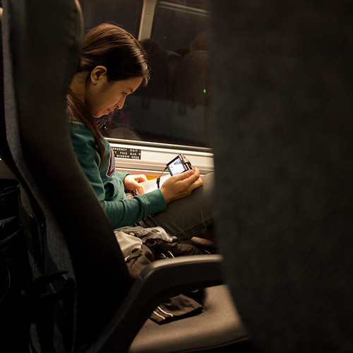
Chimping Her Camera

The lens' wide aperture of f/1.7 comes in handy in low-light situations. In this photo I was able to keep the ISO down to 400, which is only one stop faster than the E-P2's base ISO of 200. If I'd had the 17mm I would have had to move it up to ISO 1,000, where noise begins to show up. I know what's been written elsewhere about the E-P2's high ISO performance and how it's acceptable up to ISO 1,600, but it's been my experience to keep ISO as close to base as possible. So I juggle shutter speed, f-stop, and ISO in these situations, giving priority to keeping the ISO as low as practical. It's a shooting methodology I've had since my first days of 35mm film. After over 40 years of photography I much prefer to shoot no higher than ASAISO 400.

Welcome to Lake City Florida

Another feature I've come to appreciate with this lens is its apparent lack of barrel distortion or pin cushioning regardless of the aperture setting. The 17mm has noticeable pin cushioning wide open (f/2.8), which begins to clean up one stop down and is almost completely gone by f/5.6. But the 20mm doesn't have any to speak of, which makes shooting architecture a real joy, particularly when you don't have to clean up any distortion in post. And if you think you see distortion above, let me assure you that the concrete sidewalk in front of that Greyhound station is actually warped.

Tifton

The 20mm also has a different color character from the 17mm. I can't quantify what is different about the 20mm, but I like the colors that come out of the 20mm mounted on the E-P2. While the 17mm is quite capable of producing great color under the same lighting, I have to give the nod to the 20mm.

Ride 'em Cowboy

The 20mm makes for a superb all-around travel lens, capable of rendering exquisite detail between f/5.6 to f/8 in broad daylight. The photo above was taken with the E-P2's ISO set to 200. The 20mm coupled with the dynamic range of the sensor at this ISO can produce some pretty remarkable results.

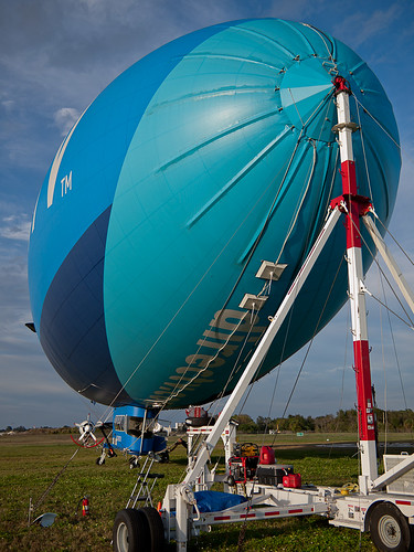
Blimp Starboard Mooring

Although the field of view of the 20mm is definately less than the 17mm (57° vs 65° respectively), it's still wide enough that with careful composition you can dramatically photograph large objects such as the DirecTV blimp. In the photo above the 20mm was stopped down to f/2.8 and ISO once again set to 100. The lighting, the dynamic range, and the depth of field, coupled with the focal point gives the appearance of sharp focus from the mooring tower to the airship's tail. Yet the background is out of focus enough to help hold the viewer's attention on the airship. I can honestly say I could not have achieved this level of image quality with the 17mm at its widest, f/2.8.

Conclusions

As good as the Olympus 17mm is, especially stopped down, the Panasonic 20mm is better, especially when you realize that the 20mm is already closed down 1 1/2 stops at f/2.8. While the 17mm is physically smaller, it's only barely so.

The 20mm actually gives exposure "breathing room" to the E-P2, allowing it to be used at lower ISOs more consistently than with any other µ4/3rds lens except the M.Zuiko 45mm 1:1.8 (which I also now own) and the M.Zuiko 12mm 1:2. And with the drop in price of the 20mm bringing the price differential between the 17mm and the 20mm to less than $100, there's no real reason to purchase the 17mm independent of the 20mm any more.

There's also the issue of build quality. I've groused about this already, but I'll say it again; ever since the early 1980s starting with Olympus OM equipment I've never had bits fall off of any Olympus lens, except for the 17mm. While I was on a trip to Boston last March the front outer ring over the blue plastic you see on the 17mm above simply fell off and onto the ground. I heard it hit but never found it in the street. The 17mm still functions, but the idea of something just falling off bothers me and gives the lens a bad mark in my book. The 20mm looks and feels better built than the 17mm. Hopefully nothing will fall off the 20mm during normal use.

I'm glad I have the 17mm, and I'm glad I had it for as long as I did. It served yeoman duty and was the most used lens of all my regular and micro 4/3rds lenses. But I've got the 20mm now, and it's going to cut into the use of the 17mm considerably, and that seems a bit sad. I wish that Olympus had released an f/2 version of the 17mm, and beefed it up a bit, but Olympus was apparently working on the M.Zuiko 12mm 1:2. At its current price of around $700, I don't think I'll be picking up a copy any time soon, so the 17mm will take the spot the 12 would have if my budget would allow it.

When Matthew wrote his review back in 2010 he called the Panasonic 20mm "the single best lens available for micro four-thirds cameras." While it now has to contend with the Olympus M.Zuiko 45mm and 12mm lenses, it still holds its own quite well with those two lenses. It isn't that the Panasonic 20mm is any worse for the Olympus lenses, it's that Olympus has finally stepped up its game to at least match the 20mm. The 20mm is still well worth the purchase, especially as part of a trifecta composed of the 12 and 45mm lenses.

last updated 29 january 2012

2012-01-27

M.Zuiko Digital ED 40-150mm f4.0-5.6 R

M.Zuiko 40-150mm R on E-P2

Concept: 3 out of 5
Execution: 3 out of 5
Yeah, but: It's just dandy for what it sells for.

Background:
Olympus has a habit of re-introducing two zoom lenses repeatedly. One lens is the 14-42mm 1:4-5.6 kit lens. The other zoom lens that Olympus has released repeatedly is the 40-150mm zoom. It first appeared along with the 14-45mm when the Olympus E-300 was introduced. It was a rather large lens with an aperture range of f/3.5 to f/4.5.  As large as it was I used mine on my E-300 quite a bit and with good effect.

While it was an excellent performing lens for the price, the biggest complaint heard from all over the 'net was how big and heavy it was. When Olympus introduced the E-5x0 series of 4/3rd cameras, it cut the size of the Mark 1 down considerably and gave it a slower maximum aperture range of f/4.0-5.6, producing the Mark 2.

The Mark 2 lens remained a staple of the Olympus stock lens kits for the remainder of the E-4x0/5x0/6x0 manufacturing run. I wouldn't call it popular, but it was certainly ubiquitous, so much so that Olympus sold a combination of the Olympus MMF-2 4/3rds to µ4/3rds and the Mark 2 lens for use with the E-P2. That's the combination I purchased, direct from Olympus, for a modest $199.

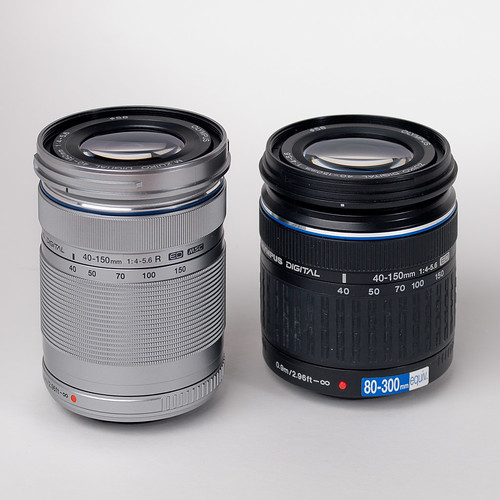
Zooms at 40mm
"R" version on the left (4th version), Mark 2 on the right

I used the Mark 2 quite a bit, both with the E-P2 as well as with my E-3. It was slow to focus on the E-P2, but it was decent enough and helped me to grab good shots when I needed to with the E-P2. And for $200, I got an affordable and adaptable short telephoto zoom. But it wasn't a native µ4/3rds lens. I wanted a native version of the lens if for no other reason than to get a lens with better autofocus speed on the E-P2.

So I waited a bit and sure enough Olympus released a Mark 3 version of the lens that was native µ4/3rds mount. It was engineered to focus quietly and given the MSC (Movie & Still Compatible) moniker. As a consequence the price moved up to $300. Olympus released it with a plastic bayonet mount (like they'd done with the Mark 2). I didn't feel inclined to spend $300 on a lens that didn't have a metal bayonet mount. The M.Zuiko 17mm, which sold for less, had one, and my M.Zuiko 14-42mm Mark 2 kit lens had one as well.

Eventually Olympus released a Mark 4 version when they released the E-P3, this time with the 'R' designation. The 'R' differences from the Mark 3 were a faster focus motor and different lens coatings. And the price went up slightly yet again. This past December, when Adorama surprisingly offered the silver 'R' version for $160, the clamp around my credit card loosened and I purchased a copy for myself.

Build and Performance

Physically the 'R' version is slightly narrower in diameter, but slightly longer, than the Mark 2. It's also lighter. In the hand the 'R' version feels better built than the Mark 2 version, but I wouldn't categorize the Mark 2 version as poorly built. The bayonet is plastic (as it was with the Mark 2 and Mark 3 versions), but it mounts snugly and tightly on the E-P2. How long it will continue to do this I have no idea.

The 'R' version, compared to the Mark 2 with adapter mounted on the E-P2, is blazing fast when it comes to autofocus speed on the E-P2.  Because of its very light weight it balances quite well in the hand, even when zoomed out to 150mm.

M.Zuiko 40-150mm 'R' at 150mm


You'll note that I have the VF-2 mounted on the E-P2. If you intend to use the 40-150mm at 100mm or longer, then you're going to want to use the EVF to help focus and compose. Using the LCD on the back at the longer focal lengths only makes sense if you have the E-P2 on a stable platform, such as a tripod. Otherwise you're going to see the image jump and dance all over the place. The EVF gives you a third point, your head, to help stabilize the whole assemblage (the other two points being your left and right hands).

With my copy I noted that the zoom ring was tight, almost too tight. With its light weight you won't have zoom creep if the lens is pointing down. Focus is focus-by-wire, which isn't all that good or bad. I've yet to have to manually focus this lens, as the 40-150mm and E-P2 always seem to pick the point I want to focus on.

I can't get over how silently this zoom focuses. It's fast and silent focusing performance is a spoiler. The only other lens that focuses this way is the M.Zuiko 45mm, which is also an MSC lens. In bright outdoor light it's a joy to use when it's needed.

Examples

I've taken enough photos with the 'R' version to come to the conclusion that it's as good a performer, IQ wise, as every other version I've owned and used. In bright light and stopped down around a stop the lens will produce nice, clean, crisp, well-colored photos with plenty of detail.

BAPS Shri Swaminarayan Mandir
BAPS Shri Swaminarayan Mandir, Atlanta, Georgia, USA
BAPS Shri Swaminarayan Mandir
BAPS Shri Swaminarayan Mandir, Atlanta, Georgia, USA
Link-up
MetLife Blimp docking, Orlando, Florida, USA

While the lens can produce good detail, it's not going to give you the same level of performance of a zoom that's five times its cost (or higher). The image of the tender getting ready to latch the airship to its mooring tower shows the limit of its resolution. This photo was taken late afternoon. If you look closely you'll see the line that connects the tip of the airship, through the tip of the mooring tower, and then back off to the right. It doesn't look quite sharp enough, not enough separation from the background sky. It would have looked better with the 50-200mm but then again, if I had the 50-200mm mounted on the E-P2 it would have handled very awkwardly, and you can rest assured it wouldn't have focus locked nearly as quickly as the 'R' version on the E-P2.

Conclusion

Remember that this is a $200 zoom lens, not the equivalent of the Zuiko Digital 50-200mm SWD (or any of the SHG zooms). But then, it's roughly 1/5 the cost of the 50-200mm and quite a bit smaller and lighter. This is the kind of lens you want in your kit to make your kit as small and light weight as possible.

The Travel Kit
Clockwise from top: M.Zuiko 40-150mm R, M.Zuiko 45mm,
M.Zuiko 17mm. E-P2 in center with Panasonic 20mm.

Look at my modest E-P2 kit, and you'll see my copy of the 40-150mm peeking out from behind the E-P2. It's a great little lens for the money, the kind you carry with you on impulse without having to worry about the consequence of it being too heavy or too expensive if something happens. In the right light it works quite well. It is, in my opinion, the best utility zoom for the money, especially if you can purchase it for $200 or less. Especially less.

Technical

I use Olympus, and all different kinds of Olympus. The two photos of the 40-150mm mounted on the E-P2 were taken with the E-1 and Sigma 30mm 1:1.4. The first image was a JPEG taken out of the E-1 and cropped in post 1:1. The photo of the two 40-150mm lenses as well as the kit photo were taken with the E-3, the ZD 50mm, and a pair of FL-50Rs, one in an Apollo 42" reflector and the other using a Rogue FlashBender.

last updated 27 January 2012

2012-01-26

Panera Bread, Yonge Street Location


Concept: 2 out of 5
Execution: 4 out of 5
Yeah, but: My very first Review By Proxy.

The Long Version: I've never eaten at the new Panera Bread location on Yonge street at Edward, and based on what I've heard from other people, I never will. Despite only being open for one week, I've had four of my co-workers spontaneously start to rave about it, and I hear people talking excitedly about it on the street.

Panera, or so I'm told, serves excellent soups and sandwiches. The prices are not quite cheap, but they're not out of line compared to other quick-service restaurants in the area, including the ones that don't leave people misty-eyed at the mention of a "bread bowl". This is exactly the sort of thing that I love, which is why I am never, ever going inside.

A wise man once said: "I've bought crack cocaine three days in a row. I'm starting to worry that I'm a shopaholic."

I'm fighting mightily against a similar shopping issue.

This blog doesn't use the star rating the way Amazon or similar clod-source sites do. Here an average score is only a modest 2/5, which is still a positive recommendation; Panera's basic concept of soup and sandwiches is good but so well established that even donut stores do it. But when I start my unsolicited raving that means a rating of a solid four out of five, which is an exceptional score. Given how many people have been telling me about Panera I had to consider a perfect 5/5 on their execution, but I just can't go that high without trying it for myself.

Which will never happen.

Sorry.


last updated 26 jan 2012

2012-01-21

TT Pocket Tools: Chopper, Keeper, and Simple


Concept: 4 out of 5
Execution: 4 out of 5
Yeah, but: Who doesn't love little bits of metal?

The Long Version: To give credit where it's due, I learned about TT Pockettools because of a review on the excellent Every Day Commentary blog. The author of that site is phenomenally hard-working, and there's a fair bit of overlap in our interests. If he starts getting into cameras, I may have to close up shop.

TT Pockettools makes something called a 'one piece multitool' or 'keychain tool'. Essentially, these are ingeniously shaped bits of metal with edges and cutouts designed to do different things. I've been vaguely aware of these things for a while, but not really interested until I saw that fateful EDC review and read those two magic words: "Snag Edge".

It's something that sets TT pocket tools apart. On the narrow end that's designed to be used as a screwdriver, nail puller, and/or pry bar, there's also a little notch that comes to a semi-sharp point. It's designed to replace a key or ball-point pen as an impromptu cutting implement, which it excels at.

I've tried it on packing tape and medium-weight plastic; as long as its victim is under tension it cuts like a knife with little chance of incidental damage to whatever else is nearby. Fibrous material, like cardboard or reinforced tape, don't give up quite as elegantly but shallow depths can be hacked through. Since I started carrying them I've needed my pocket knife a lot less.


Another interesting feature of the TT tools is that they're machined to work with a standard hex bit. Two of the styles that I ordered would be used like a wrench, where the tool doesn't enclose the bit, while the third slips over the bit and works like a "T" handle. This came in handy when I was tightening a faucet handle with very bad access – it's not going to replace my Picquic, but definitely more than a gimmick.

These pocket tools are smaller than they look, so the nail puller is perhaps a trifle ambitious. I drove a finishing nail a short distance into a dry cedar fence board, and there was no way I was taking it out with something just 2" long. It did come in mighty handy when I had to remove four dozen industrial twist-ties that were loosely sealing some plastic bags, though, so never say never.

The 'gripper' function is handled by the curved surface with fine jimping, as its diameter fits bottle caps for a little extra leverage. The two models that offer that also have bottle cap openers, which makes them exceptional companions for beverages.

Me being me, I bought two tools for myself, another as a gift, and picked up a fourth for a friend while I was at it. The tremendous thickness of the steel – almost a quarter inch, dwarfing my Helle Viking knife – makes them easy to hold and indestructible. Their price is quite reasonable, shipping within the USA is included, and the additional penalty for being Canadian is modest. I can also say that the maker is a pleasure to deal with. I placed an order late on a Thursday and they were in the mail before I woke up the next morning. The last time I had that happen I was dealing with someone in Japan, and he had time zones on his side.

So, with my blanket endoresement out of the way, I do have some thoughts on the specific models.


The Chopper is the tool that was reviewed by Every Day Commentary. I think it's the best looking, and is my favourite. The shape of it makes the snag edge handle a little more like a traditional box cutter, and it's very comfortable to hold. It's also very nicely machined, with different jimping everywhere that would benefit from it. It's an impressive little bit of work, and if I was to choose only one, this would be it.

The EDC review covers this one perfectly, so I'll move on except for one little note: the Chopper is now out of stock, and TT Pocket Tools is working on a revised model. I can't imagine what the maker could find to improve, but I'll be very interested to see the results.


The Simple is the other tool that I bought for myself. I expected to like it more than the Chopper, and do love the mini pry-bar aesthetic. But its straight edges and minimalist design mean that it's not as comfortable to hold, or as much fun to play with. Still, I don't need a bottle opener, and really like that it can form a proper handle for a hex driver bit. I imagine that this will be attached to my camera bag when I travel, as it's more robust and versatile than the Slice™ that I'll sometimes use to open the packaging on 120 film.

If there's a new revision of the Simple, all I'd really want is the curved gripper jimping added to the side cutouts. They're probably too shallow to have much use as a bottle-cap-turner, but it would make the tool easier to hold – if slightly less simple.


The Keeper is the model that was picked by a friend, and he chose it for the superior bottle-cap opening possibilities of its design. While it has the smallest pry surface of the three, I can see it being extremely practical overall, and it's also quite comfortable to use as a tape breaker. The larger cutout of the box wrench portion is probably more practical than that on the Chopper for household tasks, and makes for a good hold.

There is a fourth design, the Skull, which I didn't order and is also out of stock. Its tools are very similar to the Simple, but with a skull motif that probably makes for a comfortable grip to use as well as being a great conversation starter.


One-piece multi tools, with one paticular brand as a prominent exception, remain something that I'm only vaguely aware of. I tried looking into them a little more, but was quickly turned away by novelty designs and collector's editions on one side, and factory-stamped swizzle sticks on the other. Don't get me wrong, I can geek out with the best of them – feel free to hit some of my camera reviews – but I think that TT Pocket Tools has ruined me. They're practical but with a strong guy-toy value, are excellent designs, and are made by someone who cares about what he's doing.

Something tells me that I'm going to be a repeat customer.


last updated 11 feb 2012

2012-01-17

SOPA/PIPA


Concept: 0 out of 5
Execution: 0 out of 5
Yeah, but: If it's pro-business and the Globe And Mail still hates it, it's really bad.

The Long Version: I have an odd relationship with American copyright law. I'm affected by it without being subject to it, but Canadian copyright law – at least under the Conservative government – will eventually aspire to match it. So I've only been paying minor attention to the current SOPA/PIPA kerfuffle up until recently – frankly, I figured that the DMCA is bad enough that I wasn't really expecting anything much worse.

Life's full of surprises.

I want good copyright protection. I'm generally a photographer, and images are easier to appropriate and use than songs or movies. I'm concerned for the font designers and independent creators who are out there trying to be paid for their work, but that's not who wrote out their worldview and expects it be made into law.

Thewsreviews inherently depends on photographing and describing other people's products, and I usually have some criticism on hand even for things that I love and recommend. But even though I'm nothing more than a tiny fleck of lint in the blogosphere, I've always been a little wary of whose toes I tread on.

The morning after I wrote my review of the NBC Studio Tour I had a half-dozen hits from an internet address that's assigned to their New York headquarters, and I have to admit that I was half-expecting an unhappy letter on very nice stationary as a result. Fortunately, they seem to have an unexpectedly good sense of humour, or they just appreciate that I own the full set of The Pretender DVDs.


But what if taking down objectionable content was easier than a libel suit, with less recourse than a take-down notice? I'm sure that the packaging for Gary Fong's collapsable lightsphere is copyrighted, but I need to reproduce it in order to critique the tremendous implausibility of its before-and-after photos. I was careful not to call it fraudulent or false advertising, because I don't know that and can't prove it, but SOPA/PIPA creates an entirely new concern. A complaint about copyright infringement – asserted, not proven, and without an opportunity for rebuttal – could remove this entire website from the American edition of the internet.

Corporate culture and communications are crowding further and further into public space. There would be no way to take part in the civic discourse about Toronto's "info pillars" without a photograph of the entire installation of an Astral Media advertising billboard, including the copyrighted Bell Canada advertisement. Those photos made it all the way to city hall. Should the companies that are the subject of the criticism have the right to block them from being seen? Fortunately for me, everyone involved in this example is Canadian, but it's a very real scenario for Americans who formerly liked the whole 'free speech' idea.

Thewsreviews is a hobby blog; I hope that people find it entertaining and useful, but it's here because I and a few others enjoy creating new content for it. I'll keep it going for as long as it remains engaging, but that won't include the time between 8am and 8pm on January 18, 2012.


last updated 17 jan 2012

2012-01-16

Fujifilm GA645Zi


Concept: 3 out of 5
Execution: 3 out of 5
Yeah, but: Despite its large size, it's a very small camera.

The Long Version: Fujifilm makes good cameras, and always have. While their most recent renaissance has surprised everyone, including Fuji, they have a long tradition of making quirky cameras that are genuinely designed for photographers. That must be why they also release more cheap mass-market point-and-shoot cameras per year than any other manufacturer – it keeps their marketing department distracted.

One year ago today – in an unbelievable coincidence – I looked at Fuji's GX680III, their ultimate medium-format studio camera. I was impressed enough by it to start looking at other medium format cameras, which is how I ended up owning its smaller sibling, the Fujifilm GA645Zi. This little gem was introduced in 1998, first in the goldy 'titanium' colour, and only later in an all-black model.

The Fuji GA645 series is an entire family of fixed-lens autofocus cameras that's an extension of the previous GS folding-lens manual-focus cameras. The "6x4.5" negative is actually about 56mm by 41mm, making it small by medium format standards but still two-and-a-half times the surface area of a 35mm negative. That's definitely bigger-enough to show a quality improvement over 135 film, and makes the negatives easier to scan and more forgiving to deal with. Used properly, the 645 format gives just as much usable image as a cropped 6x6 frame, with the advantage of having a few extra exposures per roll.

More specifically, the Fujifilm GA645Zi that I use is the zoom-lens version of the older GA645 that Dante Stella has already ably reviewed. But despite the similarity of the names, the Zi is a very different model from the other variants. It's the only one with a zoom lens, and the entire front of the camera has been restyled into something that looks a little more conventional than the original.


The GA645 family of cameras have autofocus, power film loading and advance, built-in meters, and are completely at home in Program and Aperture Priority modes. I'm not quite sure what the technical definition of a "point and shoot" camera would be, but the GA's are pretty much there. They have an exposure compensation button, but that and setting your own film speed are about it for over-rides. There is a large control dial, which is used for changing settings, but this camera isn't hard to figure out.

Yet for a camera with such simple operation, there is a bit of complexity to deal with: the mode dial has "A" and "AS" positions to choose from. Both are aperture-priority, and the difference only matters when using the flash. The "AS" will use the metered exposure and add the flash for fill, which is how most cameras work in aperture priority modes, while the "A" mode will force the camera to a 1/45 shutter speed. Being a leaf-shutter camera, the flash will sync all the way up to the camera's 1/400 maximum, making the little pop-up useful for catchlights and fill even thought it can't light up a room.

While still on the subject of the mode dial, it's worth pointing out that the "P" mode is strictly program, without any "shift" that would let the photographer cycle through possible aperture and shutter speed combinations. And even though the large control wheel can't be used to directly set the shooting values while in Program mode, changing the exposure compensation remains a button-and-dial task. But as Program protects the camera from running out of shutter speed in daylight, it's still what I prefer to use.

It also doesn't hurt that "P" is right next to "Off"… convenience is king.


If you squint your eyes just right, the GZA645Zi is a spitting image of the current Fuji X10 compact camera. Okay, maybe they're not twins, but there's a definite greyhound-and-whippet family resemblance.

The medium-format GA645 is about the size of a big 35mm SLR, but much smaller than a "pro" body, or even a midrange one with a compensator-pack strap-on handgrip. Compared to a basic D700, it's a little longer but less high; when turned off it's thinner than the SLR with any lens attached. Yet if the two aren't side-by-side, the GA645Zi looks bigger and bulkier than it really is. The body is plastic, and not as sculpted as contemporary cameras, but perhaps it's the medium-format reality breaking up the expected proportions of dials, lens, and viewfinder that makes the camera look bigger than it is.

But despite the camera's respectable physical size, the GA645 is very small. It has a vertical footprint - length times height - of about 175 square centimeters, and a film surface of 23sqcm. That gives it a camera to sensor-size ratio of 7.6:1, while one of the smallest 35mm film cameras ever made, the Olympus XA, has a ratio of 7.4:1. The contemporary "compact" Fujifilm X100 is an elephantine 25:1, and the Panasonic GF3 is 32:1. Looked at from the opposite direction, to have a typical digital happysnaps match the GA645's ratio of sensor size to physical size, the camera would be about as large as a dime. So while the GA645Zi isn't about to fit in a trouser pocket, it really is an amazingly compact camera.

Even with that bit of rationalizing aside, the GA645Zi is a small camera in other ways as well. It doesn't need a tripod, light meter, or any of the other accoutrements that usually go with medium-format image quality. It has a fixed lens, so there's no need for a bag full of alternative perspectives. In fact, there's no need for a camera bag at all. I found the vertical strap lugs too tempting to pass up and just carry the camera on a Domke shoulder strap most of the time. All it really needs is a few of extra rolls of film, and a new pair of CR123 batteries every year or two.


Running 120 film horizontally through the camera makes the negative 6cm high, so the width needs to be 4.5cm. That gives the GA645 a natural portrait orientation, which takes a little getting used to at first. The viewfinder zooms along with the lens, in addition to having frame lines that change to give an approximation of the frame size at different focusing distances.

The viewfinder of the Zi leaves me with mixed feelings. My subjective impression is that it's a little small and not the brightest, but then I tried it against a Nikon D7000 and the size and brightness looked about the same. But there's always a little flare around point sources of light, and it's never really crisp even with the diopter adjustment.

I suspect that part of my uncertainty about the viewfinder comes from the tunnel effect; even with eyeglasses I have no problem seeing the full frame. It's a short tunnel, to be sure, but the Fujifilm Zi doesn't have the same window-on-the-world effect as my other ZI, the magnificent m-mount Zeiss Icon.

The other non-ideal aspect of the GA645Zi's viewfinder is that it shows fairly strong barrel distortion. This has nothing to do with the lens, as it's not a TTL viewfinder, but it still makes it more difficult to create a composition that's straight, square, and level. The lens itself does have barrel distortion at its wider end, but it's not an issue at its longest setting.


The lens on the Zi is 55-90mm, which works out to about 35-55mm in 35mm equivalents – although in a 4:3 rectangle, not 3:2 – and it has two intermediate steps in its zoom. Taking about a second to power through its range, the zoom does make some noise when it's working; while it's probably not loud enough to interrupt a conversation, I wouldn't want to use it when complete discretion is required.

The Zi doesn't actually have an autofocus confirmation beep, but you could be forgiven for thinking that it does. The AF motor makes noise when working, and since the lens resets itself to infinity between focusing, the camera always makes its quick two-tone chirp, even for a quick follow-up shot of the same subject. It's higher pitched but much quieter than the zoom motor, and sounds nothing at all like the shutter of most SLRs.

Autofocus is quick, and by combining passive and active systems it can literally focus in complete darkness without needing an assist lamp. Don't think that's an opportunity to be sneaky, though, since the yellow light from the viewfinder's information display can be seen through the front-facing window.

With just one AF point, the GZA645 cameras are big advocates of the focus-and-recompose style of photography. Manual focus is theoretically possible, but it's set through the menu as a focusing distance, which is two different ways of reaching 'useless'. But even when autofocusing, it's good to be in the habit of checking the LED distance scale on the right side of the viewfinder. Make sure that the dot looks like it's marking a realistic distance to your subject, as that's the only way to know if the sensor has actually hit the right spot. If the dot's flashing then it didn't lock on, which usually tells me that I'm closer than the camera's 1m minimum focusing distance.

The Zi captures sixteen shots on a roll of 120 film, and the film loads directly into the camera instead of being run through an insert. That makes it less complicated to load than a Hasselblad, in that it doesn't require more than two hands, and there's nothing to lose or break that can't be replaced for the cost of another roll of film. Simple. I like that.


The tremendous image quality in a (relatively) compact package, straightforward operation, and long battery life makes for a powerful travel camera. Autofocus makes it less taxing to use, auto film winding and advance means fewer chances for user error, and its somewhat goofy appearance should make it less attractive to the criminal underworld. This really is a medium-format camera that you could hand to a stranger in a tourist spot anywhere in the world, and not only get it back, but have them take a well-exposed and accurately focused photo with it as well. Just try doing that with a Leica or a 'blad.

The one real travel-camera shortcoming that it has is its slow lens, which reduces the usable margins at the edges of the daytime, but it turns out that that doesn't matter as much as I expected it to.

The Zi is an incredibly stable camera to hand-hold in low light. While I would stay above 1/30 for photographs that depend on fine detail, with care shutter speeds of 1/15s or lower are perfectly reasonable. When properly braced I've come away with adequately sharp photos from 1/6 second exposures, even though the camera remains hand-held. It's a substantial camera with a dainty little leaf shutter, so despite its not-too-bright lens it still performs remarkably well during dawn, twilight, and bad weather.

For tripod-night photography the Zi is still a decent contender, even though adding a cable release and handheld light meter removes much of its size and simplicity advantages. Aperture priority mode will only meter down to 2 seconds, and beyond that needs the "bulb" mode to be set with the camera in manual mode. There's a threaded socket for a traditional mechanical cable release on the side of the camera body, and the lack of a mirror and the aforementioned dainty shutter means that there's essentially no vibration when the photo is taken.


One potential problem that only applies to the GA645's Zi model is that the info LCD is on the film door, and connected to the body with a ribbon cable that can fail over time. This panel is a secondary display for the shutter speed and aperture, and displays the film setting (120/220), battery status, iso, frame counter, and exposure compensation value. It's also used to set the time and choose the data that is imprinted below each frame. Losing this display can cause some problems, and cameras without it should be considerably less expensive than fully-functional ones.

But there are a couple of work-arounds. There is an indicator in the viewfinder that shows when EV Comp is active, but not the amount or direction, although the exposure compensation is reset every time the camera is turned off. So one way or another this can be set – in half-steps – by feel. The iso value can also be set even if the display isn't working by counting the number of clicks. Spin the dial a lot in one direction; camera-left turns the value down and camera-right turns it up. The steps are Auto (for Fuji's bar-coded film) and then proceed in thirds-stop increments from there. Simply count out: 25, 32, 40, 50, 64, 80, 100, 125, 160, 200, 250, 320, 400, 500, 640, 800, 1000, 1250, 1600.

If the LCD is working, then the letter "A" will show when the iso setting matches a Fuji bar-coded film's box speed. This could be a useful setting if the camera is being used with different sensitivities of Fuji film, but all of the 120 film that I like is 400, and I typically choose a lower speed to force a certain amount of over-exposure anyway.


I see two main uses for the GA645Zi. Naturally, it's an excellent choice as a simple camera for casual and street photography, but with the quality of medium format film. Whether it's travelling to distant lands – Disney, Marine, Holy – or a back alley nearby, it's a robust and unassuming camera that can be slung over a shoulder and carried with ease.

The other role for a GA645 is as a secondary camera: the smaller, simpler companion to the main rig. Having one of these in the camera bag that also houses something more substantial, like a Hasselblad or a Fujifilm GX680, means that only one type of film needs to be carried. This simplifies logistics and opens up photo opportunities that the Serious Camera on a tripod can't do.

I love being able to go out for a day with just a couple of rolls of film in my pocket and the camera in hand. I try to keep my camera bag under ten pounds when it holds everything for a trip; the Zi weighs two pounds and only needs film. The flat profile of the vertically-carried GA645 means that it's less bulky than an SLR when it's slung on a shoulder strap, and the plastic body doesn't worry me when it scrapes and bumps into things.

While it wouldn't be my choice as an only camera to own, the GA645Zi is the first one that I reach for when I want to carry something good for no particular reason. That might sound like an odd endorsement, but I spend most of my time with nothing pressing to photograph, so having a camera with great image quality but a less serious intent becomes a huge asset. I'm making a real effort to simplify, relax, and embrace the vernacular. Having a little camera like the GA645Zi has been a huge help for that.


All of the photographs for this review were taken on Fuji 400H film, including the photos of the camera, which were captured with my Fujifilm GX680III. Since the Canadian Fuji reps were okay with me photographing their X100 prototype with my Zeiss Ikon while it was loaded with Kodak film, that only seems fair.


last updated 16 Jan 2012
2012-01-11

Canon Powershot S100


Concept: 4 out of 5
Execution: 4 out of 5
Yeah, but: I never say "Highly Recommended"…

The Long Version: I've never been a stickler for image quality from a compact camera. I simply categorize them as acceptable or unacceptable, and to a large extent that also takes their other abilities into consideration. Everything in photography is a compromise. It's normally enough that a little camera is small, because it's easy to find bigger cameras that are significantly better.

The Canon S100 has challenged that. Its image quality is genuinely good.

Photos are generally detailed and well-exposed, and Canon has clearly targeted sensor noise as a priority. At iso400 artifacts are non-existent and grain is trivial; iso1600 and 3200 are surprisingly usable, and iso6400 isn't appalling. Unusually low light can cause some blotchiness, and shadows can appear as simply denser areas of grain, but at the end of the day I wish my GH1 was this good.

Now, there's no reason to be overly excitable; TANSTAAFL always applies. The tiny sensor that enables the camera to be so small still has its price to pay, and the S100 has modest dynamic range and can suffer some blooming from high-contrast subjects. But its jpegs are good, and its raw files are better: there might be some point to this whole "advanced compact camera" idea after all.


I never thought I'd say this about a little camera, but the S100 is actually a viable choice for low-light photography. The photo above is a quarter of the original frame, although still massively downsized; here is a version that's about 50%. It clearly has some issues, but it was taken at iso6400. That's ridiculous. I'll also admit that this had a 1/200 shutter speed at f/4.5, the maximum at the 15mm (70mm-e) focal length. I could have dropped to iso3200 without any problem, but I was specifically pushing to see what the little beast could do.

But all is not perfect: I've been surprised by how much difficulty the S100 has in autofocusing at night. I would have thought that the car headlights would be enough of a target, but the camera only locked on for the third attempt. Other night-time outings have borne this out, and I actually think that my Panasonic TS3 is better at focusing in low light. That's pretty embarrassing, even though the S100 stomps it in every other photographic comparison.


It's not commonly known – because it's trivial and irrelevant – but Canon compacts were both my first film and first digital cameras. So having another pocketable Canon feels a little like coming home, which wasn't the case when I had a short-lived fling with an SX20 superzoom. Canon makes good cameras, and compacts are something that they just do right. It continues to amaze me that every new generation of Elph has the same basic menu structure and controls. They haven't fundamentally changed from my Powershot S400, which I bought in 2003 for $675, and they were already well established back then.

Canon may release new models with clockwork punctuality, but there's a core maturity to their compact cameras that upstarts like Panasonic or Samsung lack. The divergent little nightmares that Nikon calls Coolpix just emphasize how successful Canon has been at creating a consistent user experience and aesthetic. The SLR wars are occasionally characterized as "Coke and Pepsi", but for their compact cameras it's more like Coke versus fourteen different store-brand colas.

On that theme, it's refreshing that the S100 comes in two different flavours. The black model has a grippy texture to it, which adds a functional element to the finish. But despite being an enduring fan of that treatment on Canon's Elph line, ultimately I had to choose the silver. It's almost a pewter colour, which looks very handsome, and the Canon logo is more subtle than it is with the white lettering of the black model. Believe it or not, picking the colour was the hardest part of the purchasing decision.


The "ring func" button is a highlight of the S100. The S90/95 had it in a bad position on the top deck, where it was hard to reach and mimicked the power button. Canon has solved that problem with the S100 by assigning it to the top-left position on the rear control panel. This is the easiest button position to press, and it's well chosen because it can be reassigned to do other functions. What stops this from being a complete win for the S100 is that the S9x already had a customizable button in that spot.

My cameras live in aperture priority whenever possible, so I'm using the custom ring configuration to make the front ring control the exposure compensation and the back dial control the aperture. Initially I wanted those roles to be switched, but apparently that's still asking too much; with a little more experience I've actually come to prefer the mandatory arrangement.

Since I have no need to change what the control ring does, I've assigned its function button to select the iso value, which works out brilliantly. Pressing the ring button a second time puts the camera into auto-iso mode, and a third time dismisses the control. Alternatively, from the auto position it's just one button-press (left) to reach iso6400 or iso80 (right), which are the two specific values that I'm most likely to want. No more than four button presses to call up the control, select any of the three most likely positions, and then clear the menu. That's excellent.


The display button has been moved to the four-way controller to make room for a movie record button. This is buzzword-compliant, and saves the need to change the mode dial for impromptu acts of citizen journalism. If I ever want to record a movie this could be an advantage, but sometimes I activate it accidentally even though the button is protected by a raised surround. Sure, memory cards are cheap these days, but batteries aren't.

Moving the Display button to the four-way demotes the self timer to the function menu. This is absolutely a loss. The only saving grace is that the func/set button usually returns to the last item used, so switching the timer off again is easy. And unlike my Panasonic TS3, the self timer remains active after the shutter fires. This is the way it should be.

The S100 also has Canon's customizable self timer. The delay can be set from nothing to thirty seconds, and it can take up to ten photos. Setting a quicker eight-second delay and taking three shots instead of one is an excellent way to take family photos – less time for the smiles to freeze, and then two follow-up shots of everyone looking relieved and happy.


The S100 is a little long exposure monster. One significant new feature is a built-in optical three-stop neutral density filter, which was formerly reserved for the G-series. This is an awesome inclusion for a camera that can't accept screw-on filters. The S100 can be persuaded to take as much as fifteen seconds for an exposure, but it gets even better than that.

Enabling the "Safety Shift" menu option gives the camera permission to over-ride the user's settings in Aperture Value or Time Value – shutter-speed priority – modes for under/over-exposure protection that still respects the exposure compensation settings. Using it at night guarantees the longest possible exposure without photographer intervention as conditions change. That's exceptional for night-time city photos, among other things.

Set the Tv exposure for its maximum of fifteen seconds, and the camera will work its little heart out to make it last that long. Sensitivity will be reduced to iso 80, the aperture will close down, and only if that's not enough will the shutter speed be increased to create an exposure that's not a blown-out white mess. Of course, if you like blown-out white messes, the camera can still do that manually even when Safety Shift is turned on.


The S100's lens has moved to a 24-120mm equivalent; it's f/2.0 at its best and hits a mighty f/5.9 at the telephoto end. But with all of the numbers that are used to market cameras, it's easy to forget that a lens aperture is an actual thing that takes up room. An f/number is a ratio where "f" is the focal length in millimetres, so math is our friend.

The physical aperture in the S100 is about 1mm across throughout the room range, while something like the Olympus XZ-1 is 3.3mm at its wide angle and 9.6mm at the telephoto end. A similar f/2.5 aperture at the S100's 120mm-e setting would need to be about the same size as the front element.

The lens specifications on the S100 are about right for a standard point-and-shoot. That's obviously not the price point or feature set that the S100 wants to play with, but it's not unreasonable to judge the lens based on cameras of similar size. In exchange, the S100 doesn't need a lens cap and is considerably more 'pocketable' than the other raw-capturing compacts. Life's a barter.


Cushioning the lens design somewhat is in-camera distortion and shading correction for jpegs, and Adobe has a profile for the S100 in its latest Lightroom / Camera Raw software. It's not quite perfect, but this is something that I'm very picky about, so saying that I'm satisfied with the S100 goes far beyond the level that even fairly hard-core photographers will care about.

The lens has six aperture blades, which hardly matters because the whole issue of background defocus is essentially moot. From photographic tests I'll say that the same depth of field from the S100 at 24mm-e and f/2.0 looks like my GH1 at 24mm-e and f/5.6. Extrapolating, that's the same as a 1.5 crop at f/8, or a 35mm camera at f/11. The S100's f/2 aperture lets in a lot of light, but it's not much of a creative control.

It's nice that the camera has fully manual over-rides, but my advice is to just leave the camera in Av mode with the aperture wide open. The S100 is still basically a point-and-shoot, just one that can be guided in its decisions.


The S100's user interface still has some quirks; the one that I keep tripping over is how the exposure bracketing is enabled. When working in the Function menu any additional choices – like setting up exposure bracketing – is done by pressing the Menu botton. But adjusting the exposure compensation while taking photos also brings up the option to set up exposure bracketing, and this time it's selected by pressing the Display button.

Pressing the four-way controller's button for the flash also brings up the option for a submenu to adjust its settings. This one is activated by pressing the Menu botton.

The exposure compensation can be set to plus or minus three stops. The camera takes three shots, with a compensation range that's plus and minus from one third to two full stops. Using them in combination can make the camera under or over-expose by five stops, which is pretty nifty. I'm sure someone out there will find a great use for it – after all, who would predict that the S100's Safety Shift and ND filter would be perfect for my passion of taking long exposure photos on escalators?


Something that disappoints me with the generally-snappy S100 is the need to wait for the on-screen menus to appear. It's not possible to stack commands – to press buttons in the right sequence and let the camera to catch up. That's a pity. Instead of using the camera transparently, I find myself interrupted by the need to look at it and think about what it's doing.

There's also a certain inconsistency in how selections are remembered. When the camera is turned on it will remember if the neutral density filter was enabled, but not the self timer. Also, using different scene modes will change what the ring function does and otherwise alters the behaviour of the camera. While that's a blessing with my TS3, it's a distraction with the S100. I just don't see the need to choose landscape or portrait modes with the S100; I know what the aperture control does (not much in this case, admittedly) and I'm happy to use it. While the handheld night mode uses the cool blend-three-photos trick, it takes time to process, creates a jpeg file, and hardly seems necessary when the auto iso runs up to 1600. The Night Shot mode does produce a good-looking file, but it's smoother and with less detail than a single raw capture.


It's no surprise that the S100's battery life is pretty bad. Why should it be any different from other small cameras? The S100 has switched to the older but slightly higher capacity NB-5L battery from the 6L model that the S9x used, which might be a reason for S95 owners to stay away. I have to assume Canon had a good reason for the change.

(But it could be worse: the Canon SD4500, which is the Powershot equivalent of a Zeiss lens cap – inexplicably lousy from a company that should know better – has a battery that no other camera uses. You might as well just leave that baby in a bassinet on someone's doorstep now, because it's going to be orphaned in record time.)

A second battery is always a good idea, which I know because I don't have one. I've been using the S100 fairly intensively, and with the eye-fi SD card also taking its toll, sometimes I'll recharge it in the middle of the day just to make sure that the camera's ready to go at night. I appreciate that the S100 is aware of the eye-fi card and won't automatically turn itself off while the card is transmitting, but sending more than a couple of 10-20MB raw files over such a flaky connection is unreasonably masochistic.

But that's a story for another day.


With the announcement of the G1 X Canon seems intent on driving the G-series seriously up-market. That's a nice change, but it opens a huge gap between it and the S-series. Time will tell if there will be an "G13" to fill that gap, but until that happens, it makes the S100 an even clearer choice. Half the price, half the size; I'm sure the G1X will have excellent image quality, but the S100 will be good enough for a lot of uses that don't need interchangeable lenses.

Currently the newest raw-capable compact on the market, the S100 also has a generational advantage over the LX5 and XZ-1; naturally that won't last, but even when Panasonic and/or Olympus update their lines size and lens speed will still serve to divide the market. Nikon's last effort, the P300, targets the same form-factor as the S-series, but the Coolpix is Samsung to the Powershot's Apple, and isn't worth serious consideration.

The number of digital cameras on the market is completely ridiculous, but there are still two basic questions: how big and how much money. That does a wonderful job of narrowing down the options. After that it's a question of features, which includes image quality, which is what the S100 emphasizes. Cameras that have image quality better than the S100 are going to be bigger; cameras that offer features like waterproofing or long zoom lenses aren't going to be as good.

The theme for the S100 seems to be that little fixes add up to a much better camera. Looked at in isolation, none of the changes from earlier models, or differences from other cameras, are all that significant. But Canon has made a camera where things just work better. It's hard not to recommend – at least not for anyone who wants the best photos that a camera of its size and price can produce.

Added November 2012: don't miss my Lens Error Update to this review.


last updated 3 nov 2012

2012-01-06

Fred Cutting Board


Concept: 3 out of 5
Execution: 1 out of 5
Yeah, but: Funny, yes.

The Long Version: Sometimes you might as well just write my name on something. Penny bought me this after she caught me measuring the carrot sticks – I wanted to ensure that I cut the celery to the same size. After all, I don't want one settling to the bottom of the container when I'm packing my lunch. This cutting board has half-inch grid lines set into the wood, where they won't be removed until the surface has seen a fair bit of use.

Given my rather limited culinary skills, having the ruled lines has actually turned out to be somewhat practical, even though I don't use them most of the time. I rarely cut square to the board, and amusingly, the large photo on the back of the package shows exactly the same thing: someone cutting at an angle, making no use of the markings that set it apart.


After only a couple of uses, the Fred cutting board has warped slightly and started to split. It's perfectly usable still, but perhaps it isn't expected to be a hard-use culinary tool or an heirloom. I suppose that makes it an adult novelty product, and it's about time I owned one of those.

Time will tell if this becomes my main cutting board or not; at 9"x12" it's a little smaller than the plastic one that I like. I'll update this review in a few months when I have a better idea of how well it will hold together.


One thing that I do have an issue with is the "OCD Chef" name. I dislike pop psychiatry even more than I dislike pop psychology, and the coloquial trivialization of mental illness just isn't something to be proud of. Careful, methodical, perfectionist, precise: it's not hard to think of other names that would actually suit the product better than the one that they chose.

So in the end we have something that I'm conflicted about. It's amusing but needlessly offensive, useful but with questionable longevity. That makes it pretty typical for the company that markets fridge magnets that look like chewed gum – it's just too bad that children can't choose their parents. The idea is better than this.


last updated 6 jan 2012

contact me...

You can click here for Matthew's e-mail address.